Guidelines
Robotics that people want to work alongside.
Cobot / Contents
Start here
01 Cobot / Essence
We are Cobot. We believe a livable future is one that is sustainable, hospitable and smart. It is one where technology is both ubiquitous and seamless, improving every aspect of our daily lives.
01 Essence / Our mission
We see a future where trustworthy Cobots are ubiquitous and working alongside us in every sector, from manufacturing to logistics to agriculture to municipal services to home and garden. They are a trusted extension of your surroundings. They work, adapt and react around you, not the other way around.
To realise this vision, we need a new design for mobility that can adapt to the real world: something equally adept in a warehouse, on a sidewalk, on the road, on stairs, in the backyard, in a hospital or the back of a truck.
01 Essence / Principles
Our products are built on three core tenets.
Predictable behaviours that blend naturally with your operations.
Brilliant hardware and software that easily adapts to your application and environment.
Real-world applicability with real-world return on investment.
01 Essence / Values
Our core values.
Collaboration starts with listening, learning from each other, and empowering one another to rise to the challenge.
A clear direction and transparent decision-making empowers teams to move with purpose and camaraderie.
Trust is where we start. Trust enables us to move faster together. We earn it every day by delivering on our commitments.
We reflect on the world through fresh eyes. We are always curious, never complacent, and willing to change our minds.
We are here to make an impact and contribute to building a better future. We share our skills and insight with the community.
02 Cobot / Logo
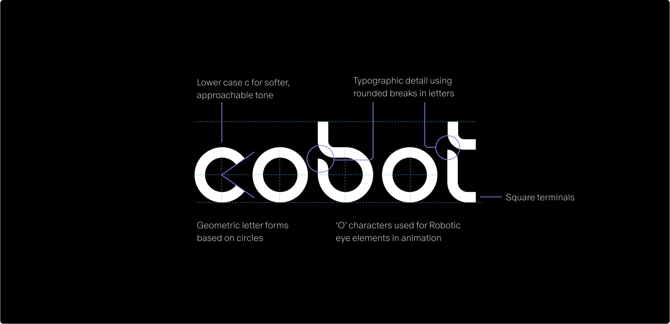
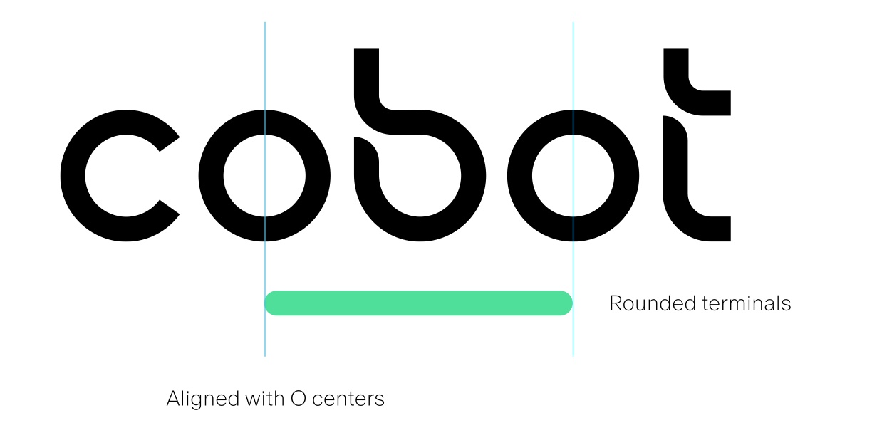
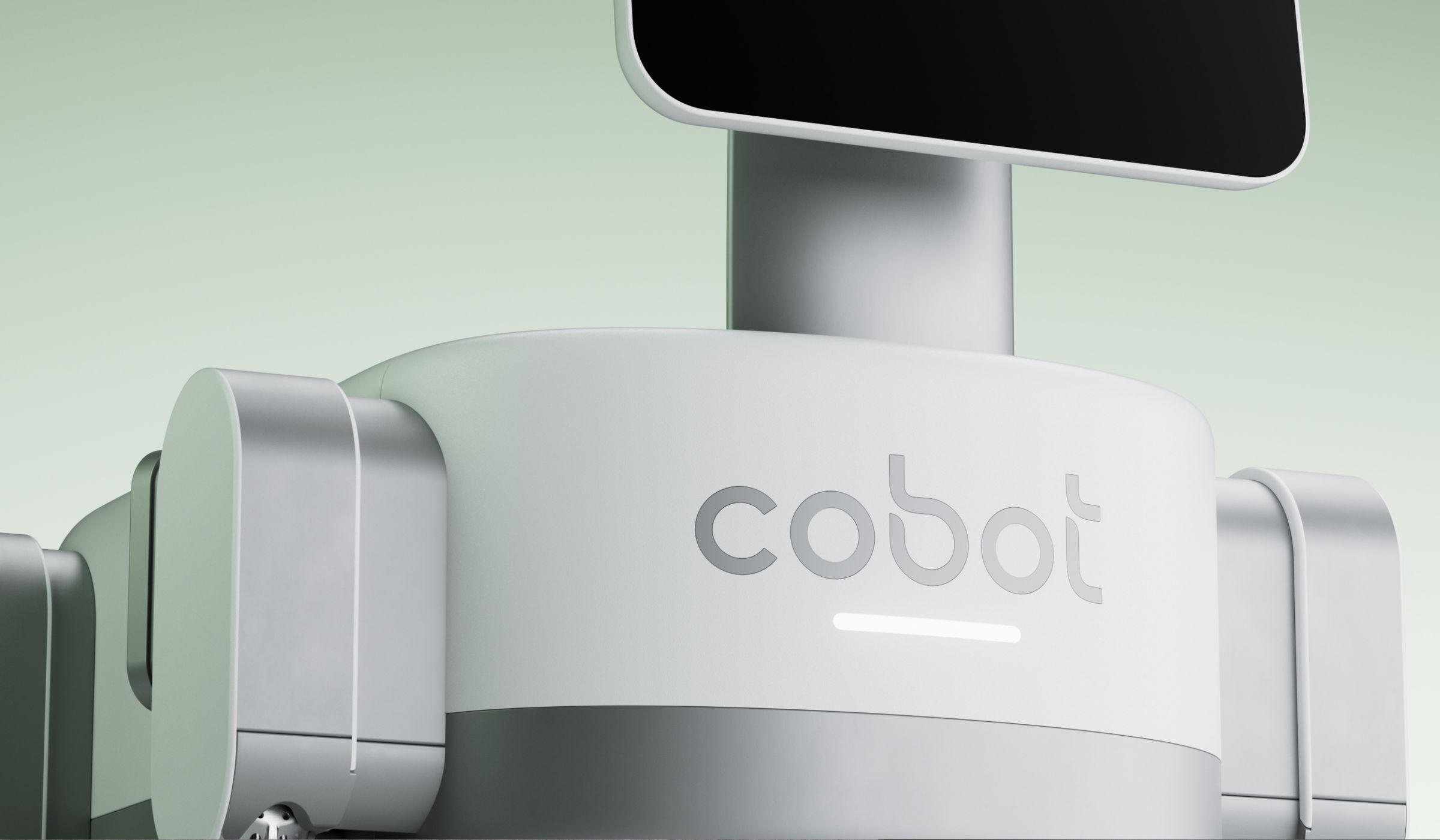
A lower case c for a softer, more approachable tone. Geometric letterforms based on circles, with a typographic detail of rounded breaks in the letters and square terminals. The 'o' characters double as the robot's eyes in animation.

02 Logo / Size and space
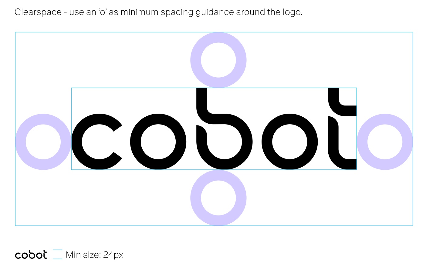
To ensure the correct clear space around the logo, use the 'o' from the wordmark as a guide on all sides. This keeps other elements from interfering with the logo and gives it enough breathing space within a design. Do not use the logo smaller than 24px on digital displays, as legibility could be compromised.

02 Logo / Colourways
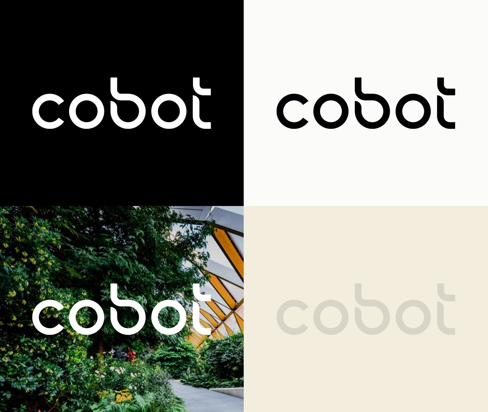
The logo is intended to be used in either black or white, depending on the background. Make sure the contrast is strong enough for the logo to be legible, particularly on imagery. For more subtle uses, like watermarks, or when the logo needs to be secondary, use a shade from the grey tones.

02 Logo / Logo positions
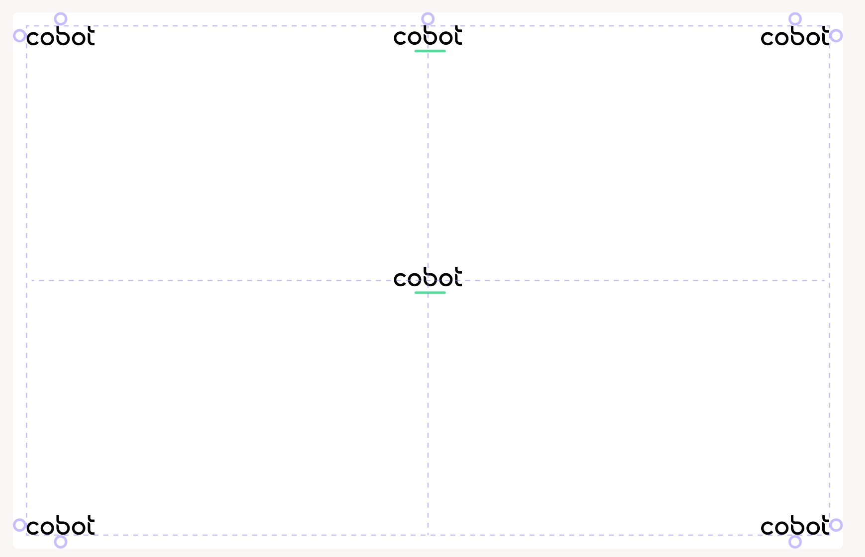
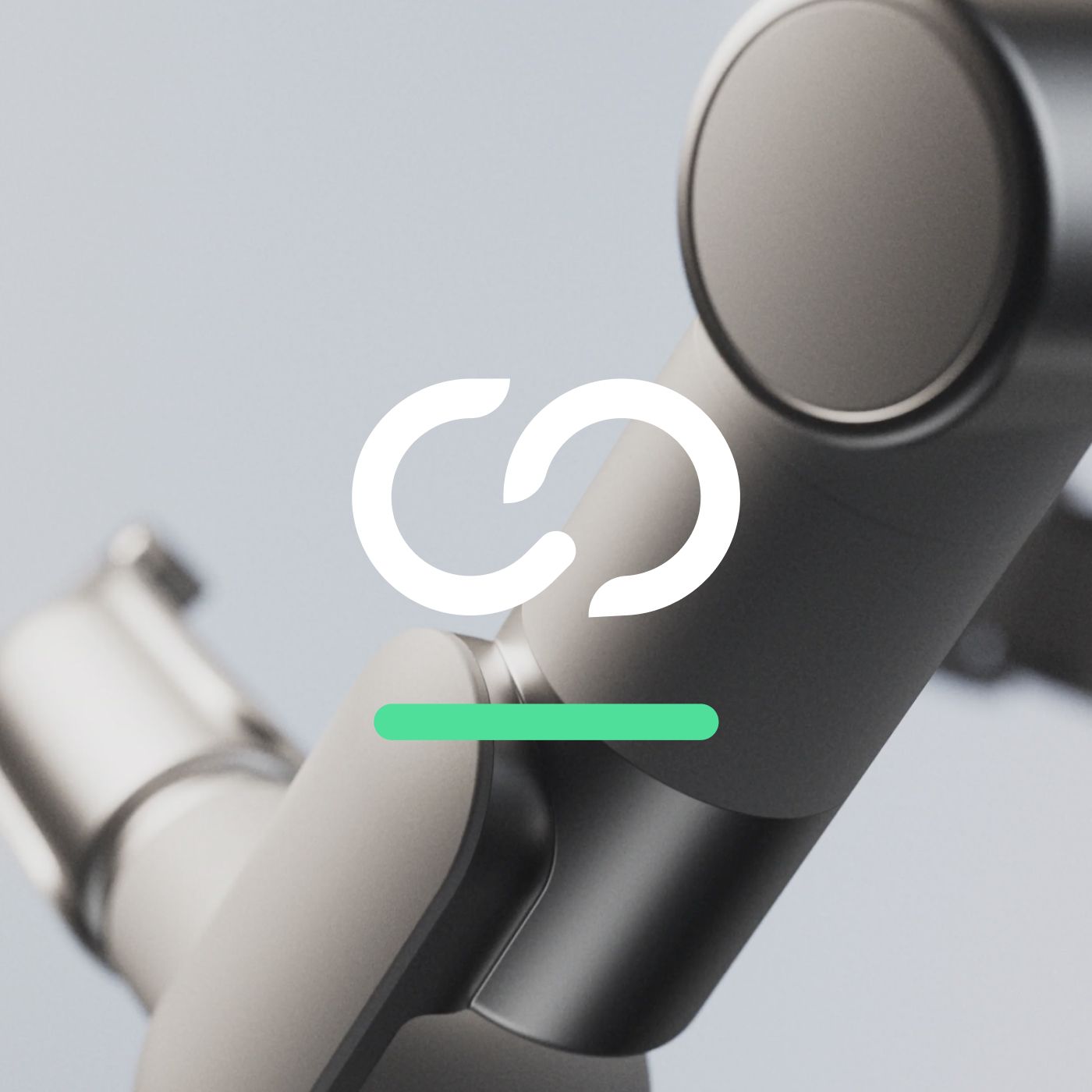
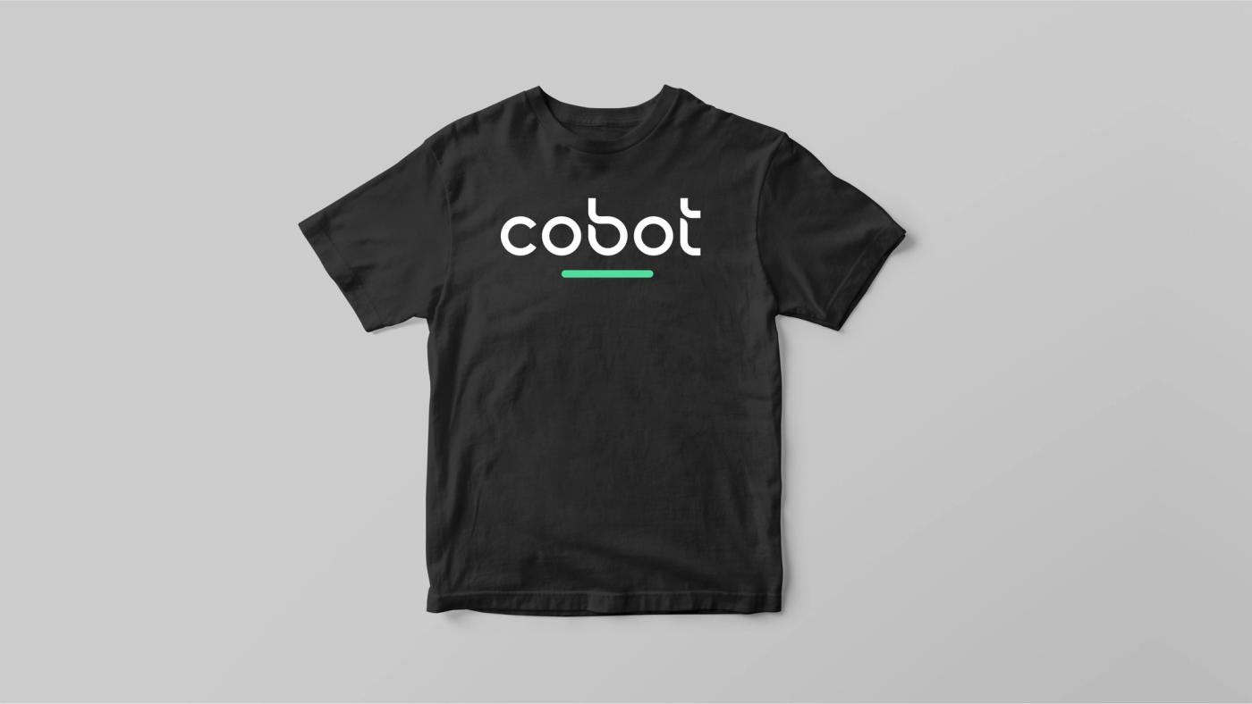
The logo can sit in any of the four corners, or at the centre or centre-top of the canvas, depending on the design and the type of communication. When the logo is used in the centre of the screen, the status bar can sit beneath it to add colour and balance. Always keep the minimum spacing, so the logo is never tight to the edges of the canvas.

02 Logo / Status bar
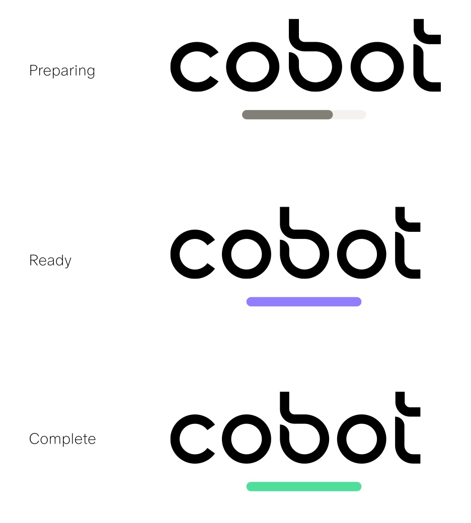
The status bar is an additional element that sits beneath the logo to add colour and balance when it is used on products and other touchpoints. Its terminals are rounded and it aligns with the centres of the 'o's. It can also indicate state, for example as a loading bar in an interface or as a colour status indicator on the robot itself: preparing, ready, complete.


03 Cobot / Symbol
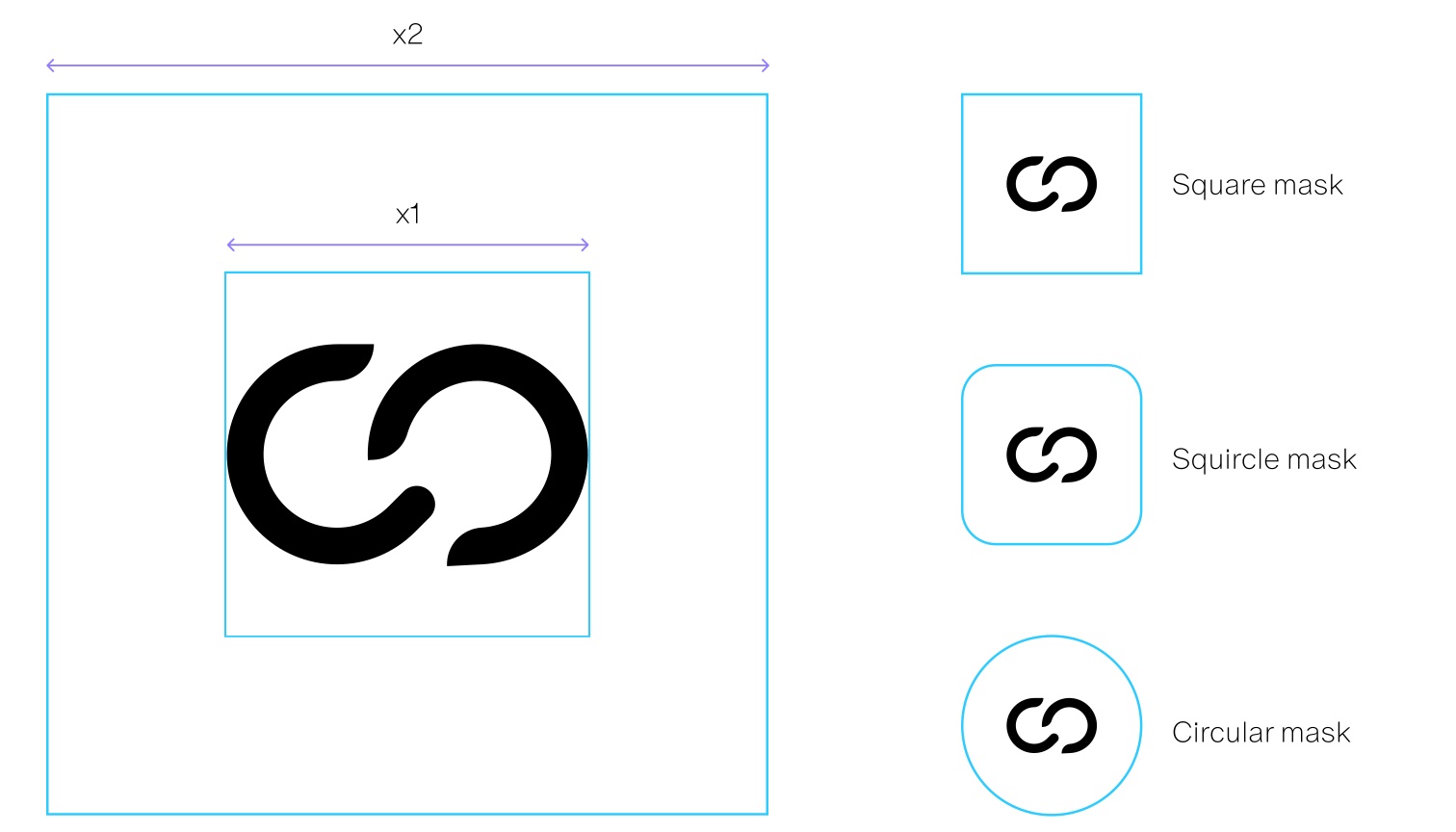
The symbol carries the wordmark's geometry on its own, for avatars, app icons and the places the full wordmark will not fit.
03 Symbol / Size and space
For the spacing around the symbol, use a bounding box twice the size of the symbol artwork. This gives the symbol enough room in the various avatar shapes: square, squircle and circular masks.

04 Cobot / Typography
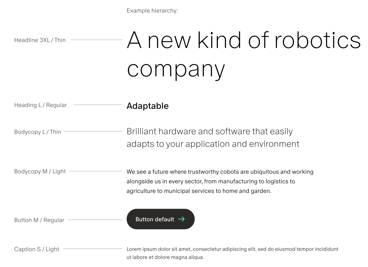
A new kind of robotics company
Oracle
Display and editorial · Dinamo
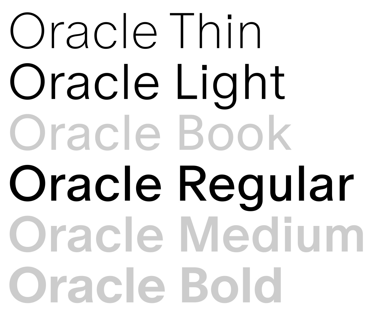
The primary font family, created by the Dinamo type foundry. In their words, an elegant sans serif with friendly, smooth contours and subtle contrast, available in six weights plus italics, with a range of alternates and stylistic sets.
04 Typography / Weights
Oracle comes in six weights. Three are used for Cobot: Thin for large headlines and body copy, Light for regular and small body copy, and Regular for subheadings, buttons and smaller UI text.
This page is set in the fallback stack, not in Oracle. Oracle is commercially licensed and is not included in the asset pack. Anyone who needs the files should be added to Cobot's licence with Dinamo rather than sent a copy of the font.

Oracle
Licence required04 Typography / Sizes
The type is set in a range of sizes from a 16px base. The larger sizes are for attention-grabbing copy, the smaller ones for detailed UI and captions.
6XL
256 / 16rem200
5XL
128 / 8rem200
4XL
96 / 6rem200
3XL
64 / 4rem200
2XL
48 / 3rem200
XL
32 / 2rem300
L
24 / 1.5rem400
M
16 / 1rem300
S
14 / 0.875rem300
XS
12 / 0.75rem300
04 Typography / Hierarchy
Keep the number of sizes and weights small, so the design feels clean and considered. The example hierarchy: headline at 3XL Thin, heading at L Regular, body copy at L Thin and M Light, buttons at M Regular, captions at S Light.

05 Cobot / Colour
05 Colour / Primary palette
The primary palette has two key colours that create a distinctive look and feel across the brand. Cobot Purple is the go-to colour for branded materials and the one people recognise as the brand. Cobot Green complements it as a fresh, contrasting shade to use alongside. The taupe tones add warmth through blocks and backgrounds. Black and white are mainly for text and UI elements such as icons, dividing lines and background blocks.
Click any colour to copy it
05 Colour / Secondary palette
The secondary palette adds extra flexibility when designing. These colours are for UI elements such as warning or error messages, or informational banners.
05 Colour / Grey tones
Grey tones create structure and hierarchy within a design. Use them to distinguish typographic elements, backgrounds, iconography and other elements, so a layout guides the reader and communicates clearly.
05 Colour / Palette tones
Each colour in the palette breaks down into a range of tones for more subtle use, giving flexibility for touchpoints such as low-contrast interfaces, print and illustration.
Red
Orange
Yellow
Green
Blue
Purple
05 Colour / Gradient
For special instances, a gradient can draw attention to certain elements in a design. It pulls the four palette colours into a single spectrum. Use it subtly, so it does not overpower the design but adds vibrance against minimal type, iconography and layout.
06 Cobot / Icons
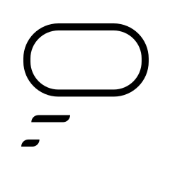
With distinct design details that complement the logo, the Cobot icon family is another branded element. It communicates quickly and in little space, while giving a subtle nod to the brand.
06 Icons / Icon grid and style
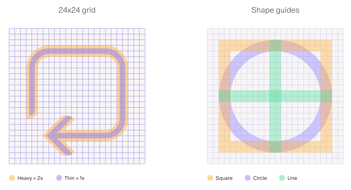
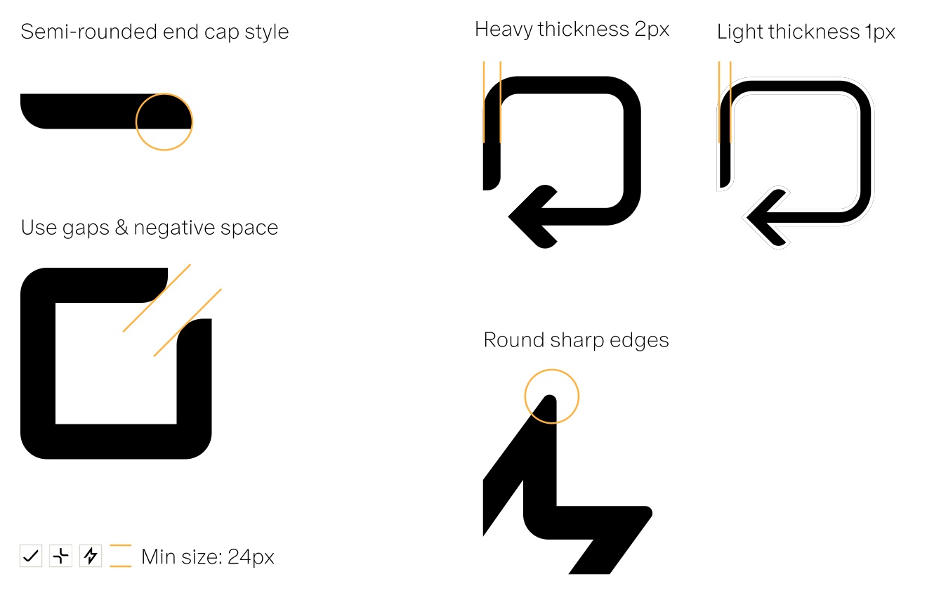
Icons sit on a 24 by 24 grid and should align to it where possible, using the square, circle and line shape guides to keep spacing consistent. They come in two weights: heavy at 2px and light at 1px. Semi-rounded end caps, deliberate gaps and negative space, and rounded sharp edges give the set its character. Minimum size is 24px.


07 Cobot / Imagery
07 Imagery / Photography style principles
Bringing people to the forefront, enabling and empowering lives for the better.
Looking to the future and inspiring an innovative view of our environments.
Communicating a seamless link between technology and humans.
07 Imagery / Subjects
Exterior spaces. Modern, open, people-centric spaces in which new Cobots will exist, adapt and improve daily life.
Interior spaces. Interesting architectural angles, materials and light as a stage for new environments where Cobots adapt, work and thrive with people.
People. Natural and friendly shots of people who may interact with the Cobot product range, using natural light, soft focus, and clean, modern, sustainably focused environments as a backdrop.
08 Cobot / Motion
08 Motion / Motion principles
Motion should be used with purpose and reason, and feel useful to the situation.
Motion should make the user feel at ease and confident with the product.
Motion should add an element of delight to an interaction.
08 Motion / Launch animation
Animating the logo with a smooth, fluid motion adds a sense of presence and introduces the brand in a professional and engaging way, echoing the way the robots themselves move and behave.
08 Motion / Adding expression
Using the language of the logo, facial expressions can communicate a range of human emotions. They add a friendly, warm and human touch and help people feel at ease. Animated, they bring delight to an otherwise standard interaction.
09 Cobot / Voice
Tone of voice was not part of the delivered guidelines: that chapter was left for Cobot to supply. What it records as the intent is a balance of friendly and professional, for a robotics company that has to connect with people.
10 Cobot / In use

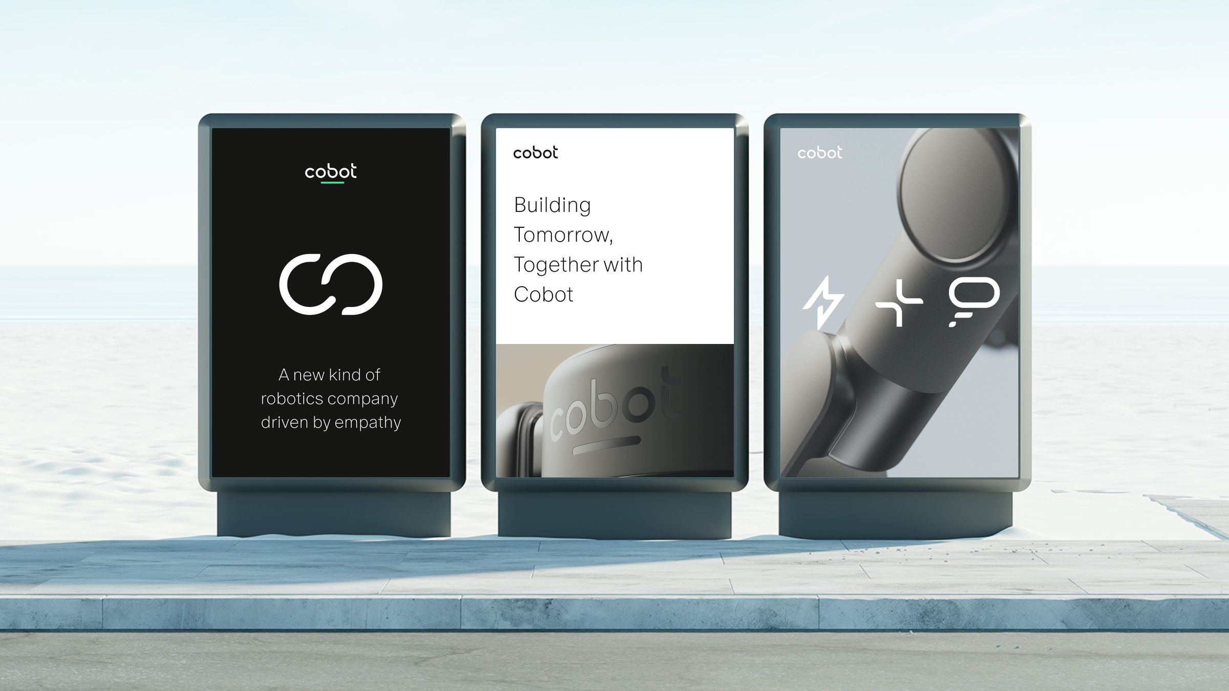
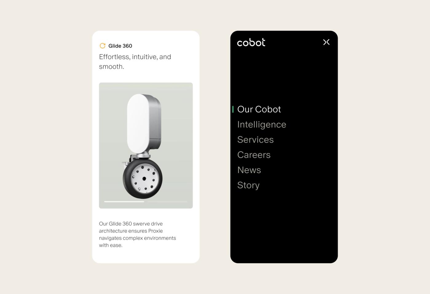
The brand on the robot, on the street, on the screen and on the team. Every image here is the work as it shipped.


11 Cobot / Files
Everything below is yours. The Figma file is the source of truth for design, the asset pack is what production uses, and the markdown file carries the same decisions in a form your own AI tooling can read and your team can edit.
Fonts are not in the pack. Oracle is licensed from Dinamo and has to be obtained through that licence, which is covered under Typography above.
This page is built from brand.md. Edit the file and the page follows, which means the guidelines, the asset pack and whatever your team generates with AI all stay on the same source.
Straight into a codebase
@import url("https://moreair.co/brand/cobot/tokens.css");
.headline {
color: var(--black);
font-family: -apple-system, BlinkMacSystemFont, "Helvetica Neue", Arial, sans-serif;
}