Guidelines
Auwa brand
The harmony between the unseen and the seen.
Auwa / Contents
Start here
01 Auwa / Essence
Essence
Auwa (あうわ) means the harmony between the unseen and the seen. Kokoro (心) is the Japanese concept that holds heart, mind, soul and spirit as one undivided whole, and the brand exists to make it visible: invisible craftsmanship in the objects, invisible Kokoro in the stories, and the quiet attention of a Japanese way of living in the journal.
The brand should feel like a quiet room in a Japanese temple at dusk, dark, warm and still, until light enters. Everything in this document follows from that one image. When a decision is unclear, the test is whether it makes the room quieter or busier.
01 Essence / How to describe it
How to describe it
Three descriptors, each doing a different job at a different depth.
Never lead with "lifestyle brand" inside Auwa's own editorial voice, and never open with "Kokoro" in first-impression copy: it raises a question before it answers one.
| Layer | Phrase | Where | Why |
|---|---|---|---|
| Discovery | Japanese lifestyle brand | Meta descriptions, press, the dinner-party answer | Instantly legible to someone who has never heard of Auwa. |
| Claim | Japanese philosophy of Kokoro | Homepage title, H1, top-level brand claim | The ground Auwa owns. Differentiates it from every other lifestyle brand. |
| Voice | Japanese living | Journal, newsletter, captions, anything in the brand's own voice | Aspirational rather than category-descriptive. Not what it is, but how you might live. |
01 Essence / Reference points
Reference points
The brands Auwa sits beside. None is a template; each shows one quality the brand should hold.
- 01Aesop
Premium through restraint. Every store is the same calm room, and every detail was cared for.
- 02Cereal
Editorial calm: a wide-tracked serif, generous space, and half the page left empty on purpose.
- 03Hoshinoya
Japanese luxury that is warm rather than austere. Dark, enveloping and close to nature.
- 04Studio Ghibli
Warmth beneath simplicity. Illustrated worlds that adults take as seriously as children do.
- 05Aman
No logo on the building. The brand steps back so the experience can come forward.
- 06Mubi
A dark, cinematic interface with serif type over imagery, proof that dark can feel inviting.
01 Essence / What Auwa is not
What Auwa is not
Headspace-style illustration pop. Wellness pastels. Busy Japanese maximalism. Tech-startup energy. Anything with a gradient that screams app.
02 Auwa / Logo
The wordmark is the logo: the letters A-U-W-A set in EB Garamond, all capitals, wide-tracked. There is no separate symbol, icon or monogram, because the identity is designed to recede.
It works because A-U-W-A is naturally symmetrical, the two As bookending the U-W centre, and that symmetry echoes the etymology: あ (heavens) and わ (earth) framing う (connection). Serif letterforms carry craft, history and intention, which are the right signals for a philosophy brand.
The orb animates. The wordmark stays still.


- Typeface
- EB Garamond, regular
- Case
- All uppercase
- Letter-spacing
- 0.25em
- On light
- Sumi
- On dark
- Washi
- Header size
- 20px mobile / 22px desktop
- Clear space
- The height of the letter U on all sides
Always
- Set it in EB Garamond, always
- Place it on a solid light or solid dark field
- Keep the U-height clear space on every side
- Use Sumi on light surfaces and Washi on dark ones
Never
- Redraw, substitute or trace the letterforms
- Place it over busy imagery
- Distort, outline, shadow or animate it
- Use pure white, ever. Washi is the light
03 Auwa / Typography
Two typefaces carry everything, with a third for Japanese text. The serif does the emotional work and the sans disappears into the background.
Everything has Kokoro.
EB Garamond
Display and editorial · Google Fonts
The voice of Auwa. Headlines, brand copy, article body, pullquotes. Regular 400 is the default weight for everything.
Journal / Store / Book
Instrument Sans
Functional and UI · Google Fonts
Navigation, labels, metadata, captions, buttons. Clean and slightly warm, and it never competes with the serif.
清明
Noto Serif JP
Japanese · Google Fonts
Kanji and Japanese-language text, including the micro-season characters.
03 Typography / Getting the fonts
Getting the fonts
All three faces are open source under the SIL Open Font License, which means they travel with the brand: they are in the asset pack, they can be installed by anyone on the team, and they can be embedded in a product without a per-seat cost. That is deliberate. A brand that needs a licence negotiation before a new hire can open a file is a brand that gets rendered in Arial.
Install the desktop files from the asset pack. On the web, load them from the foundry rather than self-hosting unless you have a reason not to, and always declare the fallback stack so text stays readable while the face loads.
EB Garamond
Included- Weights
- 400, 500, 600, 700 and italics
- Licence
- SIL Open Font License 1.1
- Fallback
- Docs and slides
- Garamond, or Georgia if it is unavailable
Instrument Sans
Included- Weights
- 400, 500, 600 and italics
- Licence
- SIL Open Font License 1.1
- Fallback
- Docs and slides
- Helvetica Neue, or Arial if it is unavailable
Noto Serif JP
Included- Weights
- 400
- Licence
- SIL Open Font License 1.1
- Fallback
- Docs and slides
- Hiragino Mincho ProN, or Yu Mincho on Windows
03 Typography / Scale
Scale
Page title (h1)
clamp(2.5rem, 5.5vw, 4.5rem)4000.01em
Section heading (h2)
28 / 32px4000.01em
Card title
20 / 22px4000.01em
Article body
18 / 19px4000.005em
Pullquote
clamp(1.75rem, 3.5vw, 2.75rem)4000.005em
Navigation
14px4000.06em
UI text and excerpts
14px4000
Uppercase metadata
12px4000.08em
Kanji (micro-season)
clamp(3rem, 8vw, 6.5rem)4000.06em
03 Typography / Uppercase tracking
Uppercase tracking
Smaller uppercase text gets more letter-spacing and larger uppercase text gets less, because small capitals need room to read and large ones tighten on their own. This is the locked set, with no one-off values. Mixed-case headings in EB Garamond keep their own 0.005em to 0.01em.
- 11px
- 0.18em. The smallest capitals, on mobile labels
- 12px
- 0.16em. Eyebrows, metadata, filters, captions on imagery, bordered buttons
- 14px
- 0.12em. Navigation and form buttons
- 16 to 19px
- 0.10em. Larger interactive capitals, used rarely
- 24px and up
- 0.04em. Display capitals
04 Auwa / Colour
Auwa lives in darkness and the light comes from within, from the Kokoro being revealed. The default state is dark and quiet. Colour enters through gradients, glows and the emotional states.
04 Colour / The named colours
The named colours
Four colours carry names because they appear together as the brand's warm-paper family, anchoring every surface across the site, the slides and the editorial moments where the brand needs to feel like an old book in lamplight rather than a digital interface.
Click any colour to copy it
Primary text on light surfaces, the wordmark, headings, active navigation.
The warm dark canvas. Footer, dark pages, the figure strip, editorial slides.
Light text, icons and borders on uniform dark surfaces. The warm paper ink.
Page background on every light page, and the light foreground over photography.
A layer sitting above Surface. Currently the menu overlay panel, and nothing else.
04 Colour / Pairing discipline
Pairing discipline
The one rule that keeps every surface consistent.
- Never mix Sumi with Washi. They belong to different families.
- Never use pure #ffffff anywhere. Surface is the white.
- Never use Washi over photography. It blends into bright spots; Surface is the foreground over imagery.
- Never hardcode a hex. Consume the token, so changing one value moves every page, component and email.
| Context | Light foreground | Dark foreground |
|---|---|---|
| On Surface (the light page) | – | Sumi |
| On Yoru or Sumi (uniform dark) | Washi | – |
| On imagery and photography | Surface | Sumi, where the image is high-key |
04 Colour / Opacity tiers
Opacity tiers
Sumi carries hierarchy through opacity rather than through extra greys, so one token moves every tier at once. Washi on Yoru mirrors the same tiers one to one.
- 100%
- Headings, titles, active navigation, the wordmark
- 80%
- Body prose and long paragraphs
- 70%
- Navigation links and hover states
- 60%
- Page and article subtitles
- 50%
- Excerpts and captions
- 45%
- Eyebrows, metadata labels, inactive filters
- 40%
- Input placeholders
- 20%
- Form underlines
- 10%
- Dividers. Anything lighter disappears on Surface
04 Colour / Emotional states
Emotional states
Five gradient families, used in the app's Kokoro revelation screens and across social content. Each is a starting point for a three or four stop gradient.
Radiant. Gold, amber, soft peach. Warm, expanding, light.
Intense. Crimson, burnt orange, dark rust. Rising and hot.
Reflective. Indigo, steel blue, soft grey-blue. Cool, receding, still.
Unsettled. Amber, ochre, muted bronze. Shifting and restless.
Serene. Sage, warm olive, soft earth. Grounded, open, calm.
04 Colour / Foundation scale
Foundation scale
The cosmic scale belongs to the app and the social slides, where gradients need to emerge from a true near-black. Keep it separate from the website palette.
05 Auwa / Light
Light
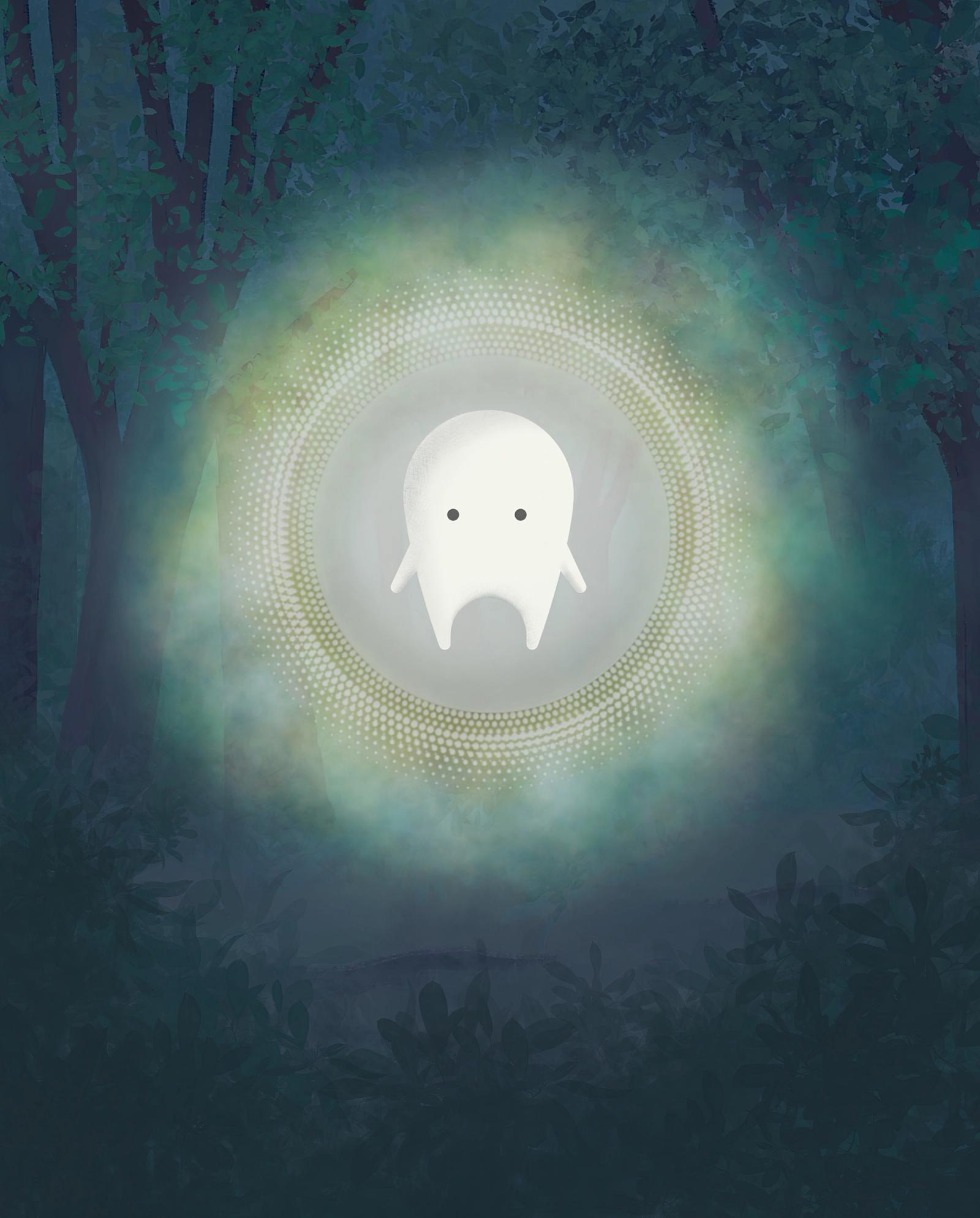
The orb is Auwa's presence before the character appears. It pulses gently, breathes, and transforms in the light shower, the moment Auwa's light reveals the Kokoro inside a thing. Away from that moment it stays atmospheric and never dominant, and it never sits beside the wordmark as a combined logo: the orb moves, the wordmark stays still.
05 Light / Fireflies
Fireflies
Fireflies (蛍, hotaru) are small lights caught in the dark: soft warm-yellow points, each breathing on its own slow cycle so a swarm never pulses in time, with a little variation in size. Japanese art has long used them this way, for brief light held in memory and for mono no aware, the gentle awareness that things pass. They live on the dark palette, never on light grounds, and are never clustered into shapes or logos.
06 Auwa / Illustration
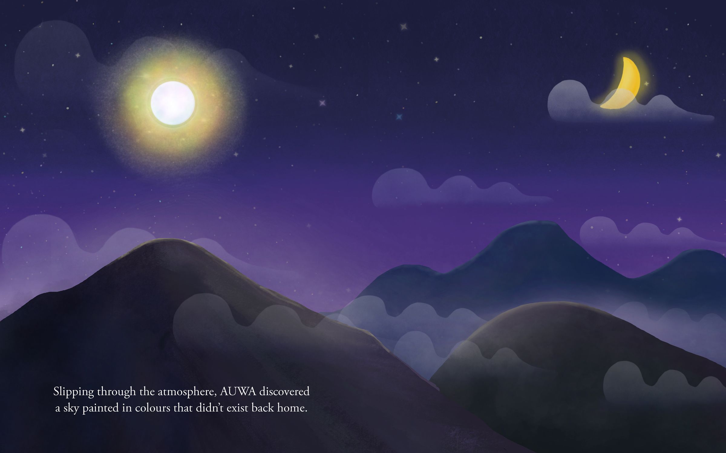
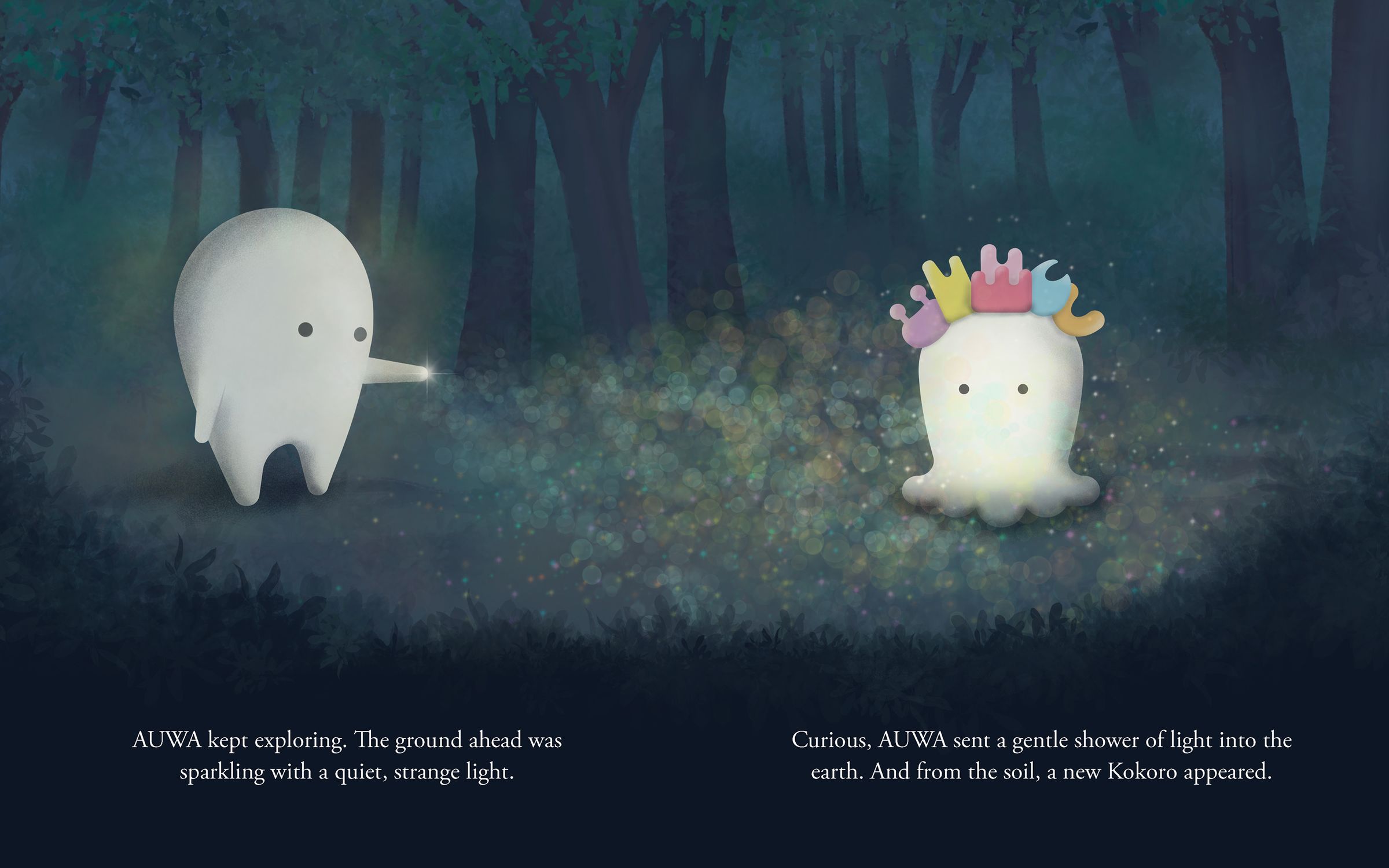
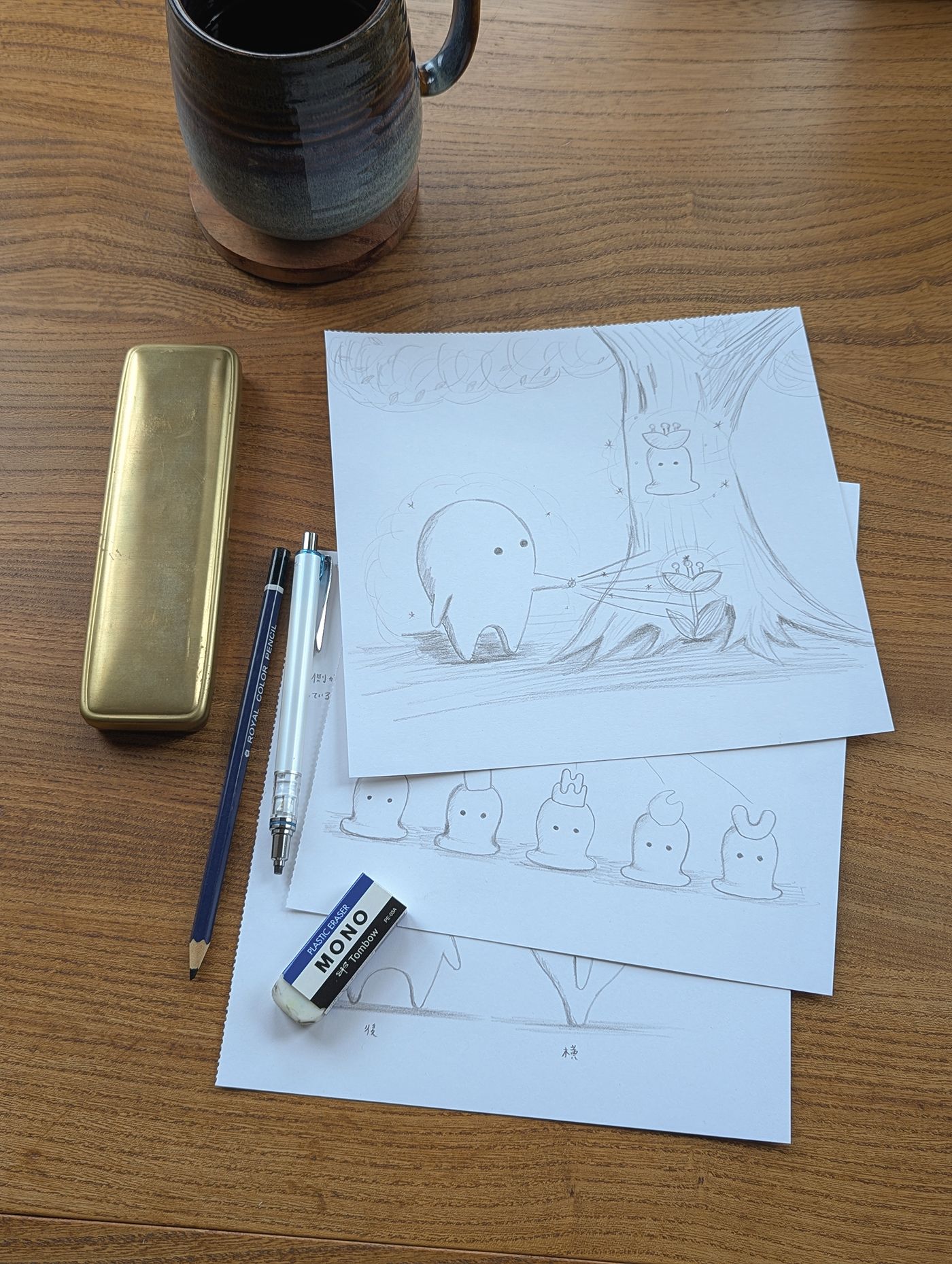
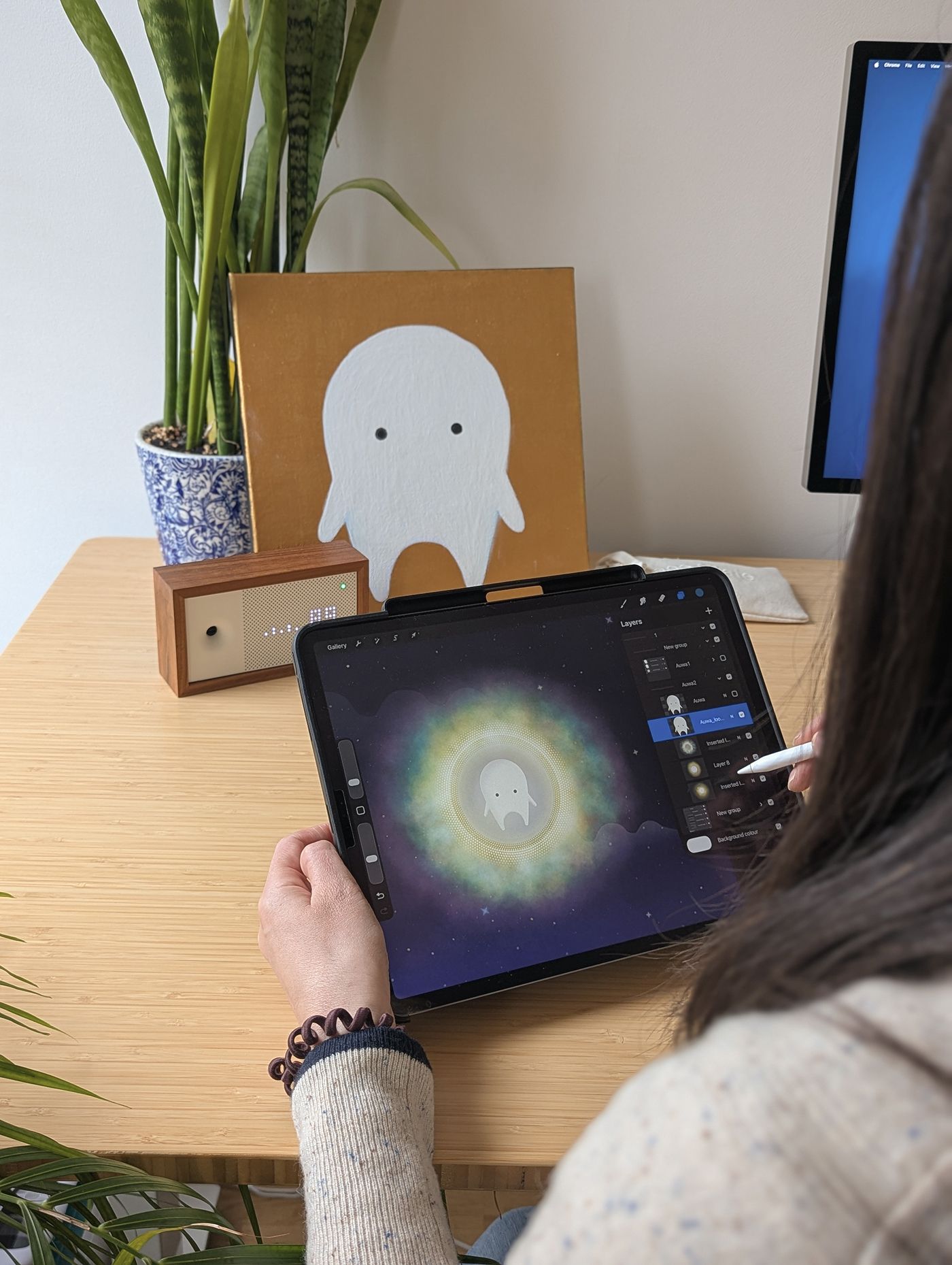
Rieko's illustrations are the heart of the world. The character has been years in the making, refined across sketchbooks, iPad sessions and field studies in Japan, and the stories are the canonical source of everything else the brand makes.
Photography and illustration belong to one world through colour and atmosphere. Both are warm, textured and slightly muted, never full-saturation picture-book colour, and both sit at home on the same dark grounds.
07 Auwa / Photography
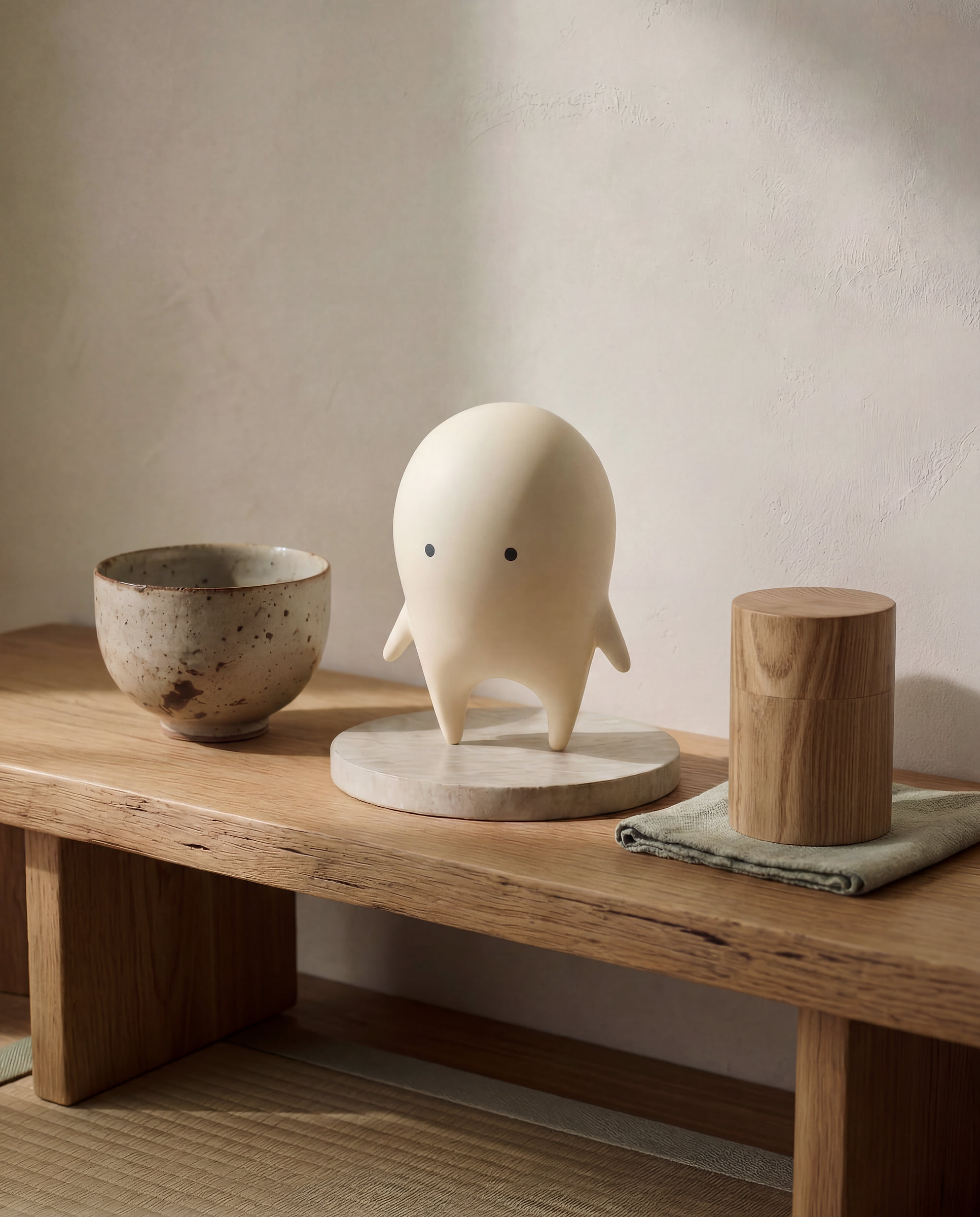
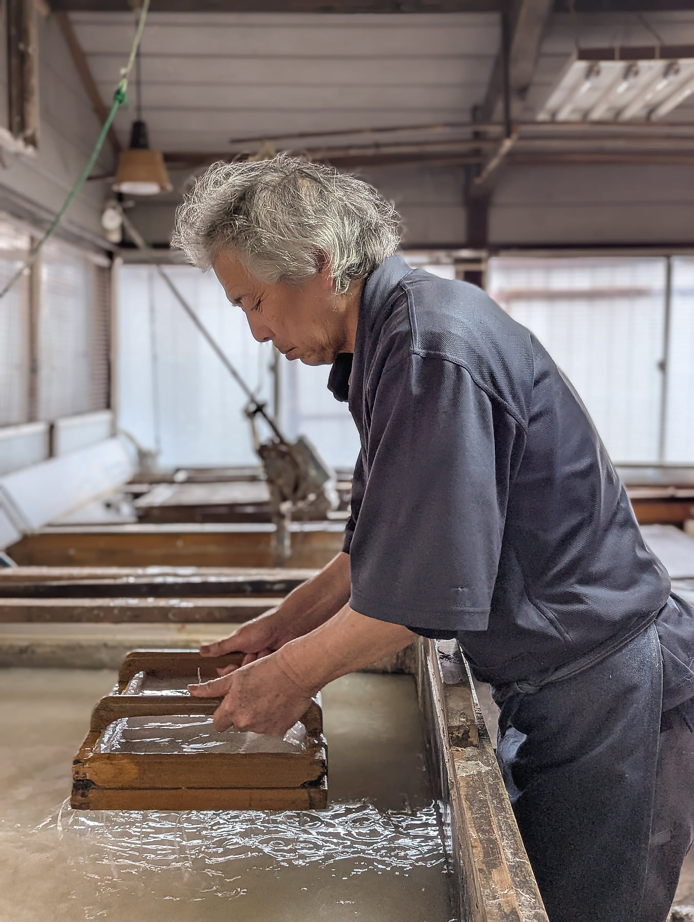
Editorial and atmospheric. Natural light, real materials, real hands at work: craft in progress rather than craft finished and staged, with room around the subject. If a frame feels busy, it is the wrong frame.
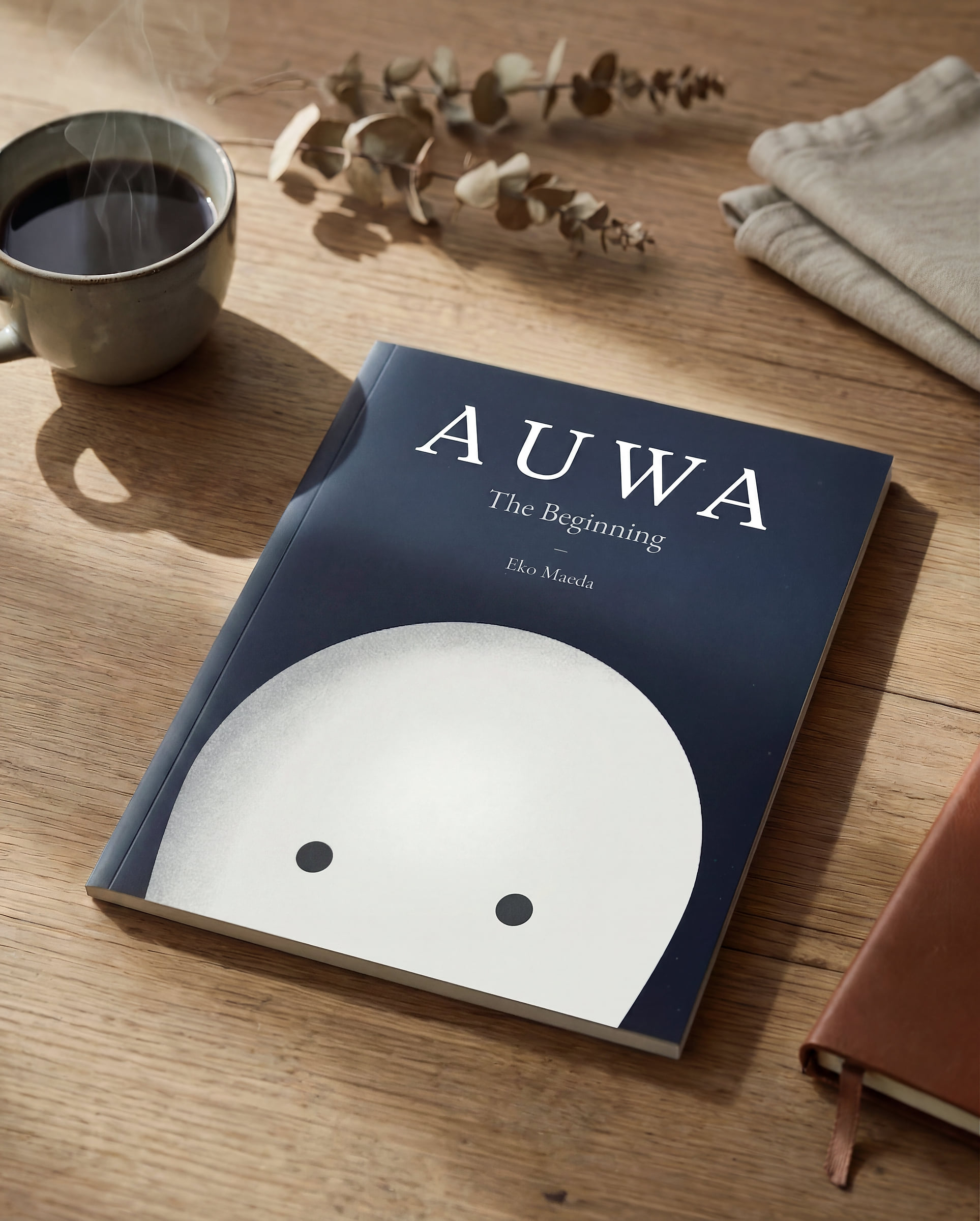
The register sits with Kinto and Analogue Life, with the warmth of Hoshinoya and the restraint of Mubi behind them. Warm but not orange, restrained but not muted, tactile but never over-sharpened.
07 Photography / Treatment
Treatment
Every photograph goes through one of three presets, and every finished image should sit easily beside the plates above. The shared rule is to pull back until you almost want to add it back, then stop.
- 01Landscape
Architecture, shrines, cedar and snow. Warm balance, lifted shadows, a slight matte lift, muted greens.
- 02Interior
Interiors, makers at work, ceramic and washi close-ups. Warmer, with no clarity push on skin or cloth.
- 03Night
Fire festivals, lanterns and low light. True blacks kept, flame calmed, and the only preset with grain.
07 Photography / What to avoid
What to avoid
Anything that reads as stock or travel blog: crowds and tourist viewpoints, arranged flat-lays, smiling models, saturated or HDR processing, and cherry blossom as shorthand for Japan.
08 Auwa / Motion
Motion
Auwa does not rush. Animations use ease-out-expo, fast departure and gentle arrival, like a breath out. Elements appear by fading and gently scaling, never by sliding in from an edge. The light shower is the hero animation and everything else supports it.
One tempo, not five. Every duration, stagger and easing comes from the locked set below, and a hardcoded millisecond value in a component is treated as drift.
For film and social, keep transitions slow and atmospheric, around half a second to a second. Never fast cuts, beat-synced transitions or zoom-punch effects.
Durations
- enter
- reveal
- hover
- page
Staggers
- strip
- grid
- hero
Easings
- outExpo
- inOut
- textRoll
09 Auwa / Voice
Voice
Quiet authority. Precise observation. Short sentences that land, longer ones that breathe. The reference points are Cereal and Monocle rather than any wellness or app brand.
Write in concrete, sensory detail rather than abstract claims. The blade coated in a thin film of camellia oil, not the blade was carefully preserved. Let the subject speak for itself and trust the reader to feel something without being told what.
Japanese terms are welcome, glossed briefly where they need it, and never exoticised.
Always
- Periods and commas do most of the work
- Colons for lists and explanations, parentheses for brief glosses
- First person plural for essays, second person only when it draws the reader in
- Let a single fragment land alone when the surrounding text is built differently
Never
- No em dashes, anywhere
- No In a world where, no here's the thing, no it's not just X it's Y
- No journey, tapestry, landscape, delve, unlock, curate or reimagine
- No stacking three fragments in a row as the dominant rhythm
11 Auwa / Figure
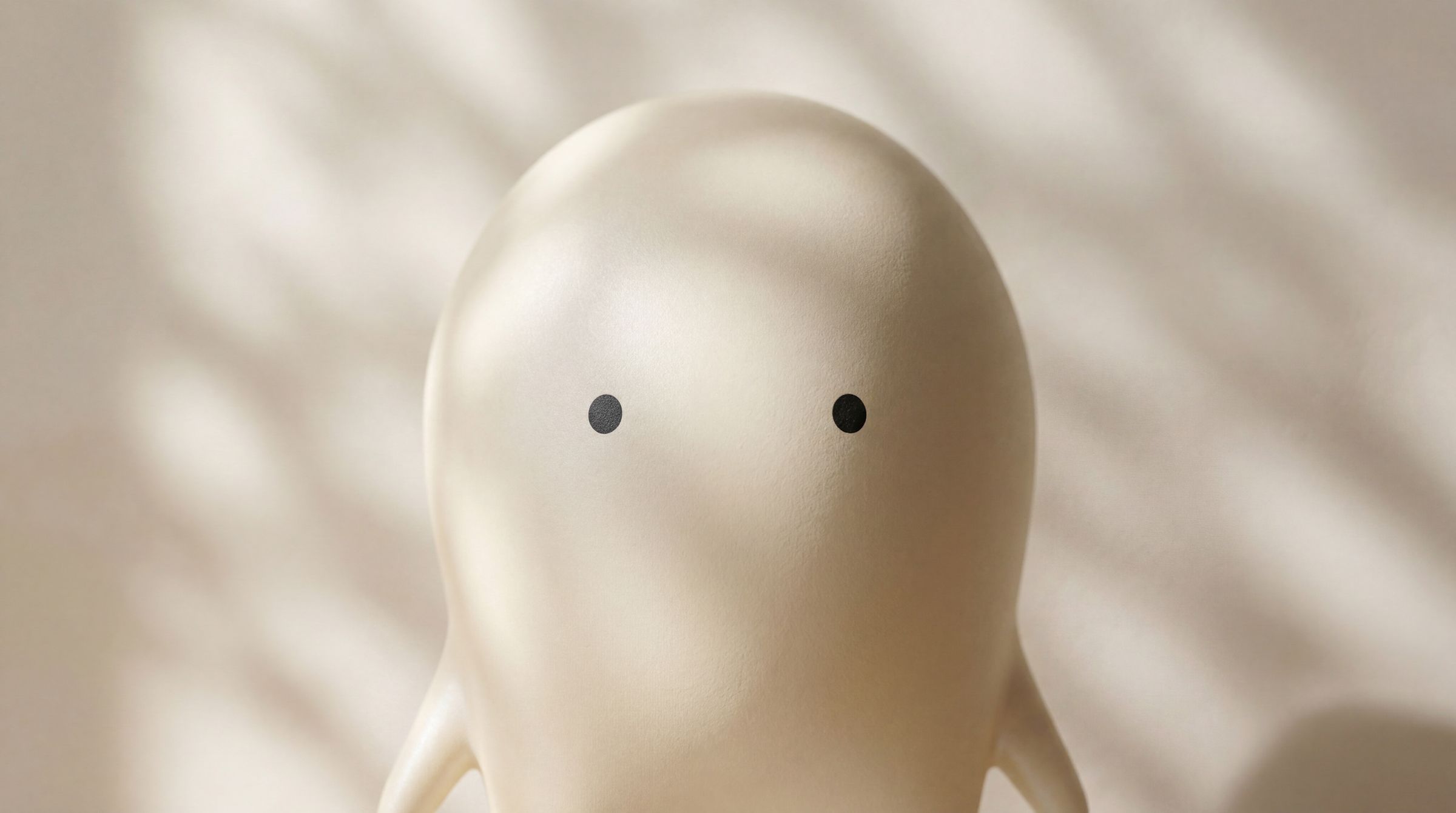
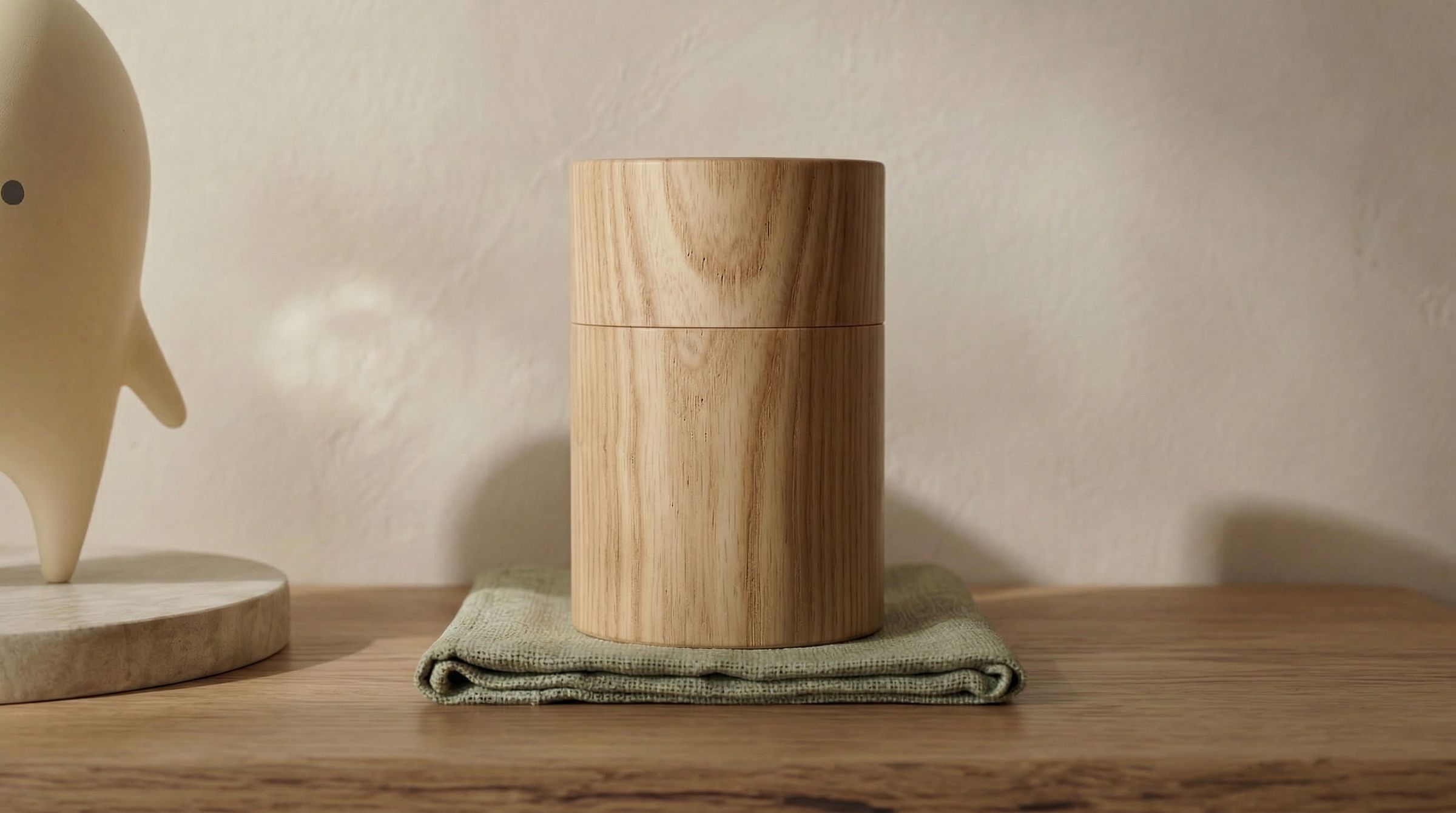
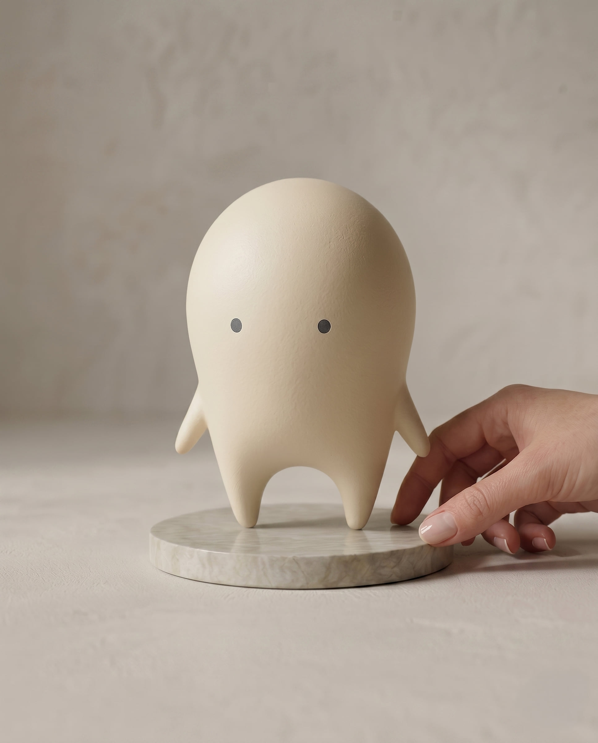
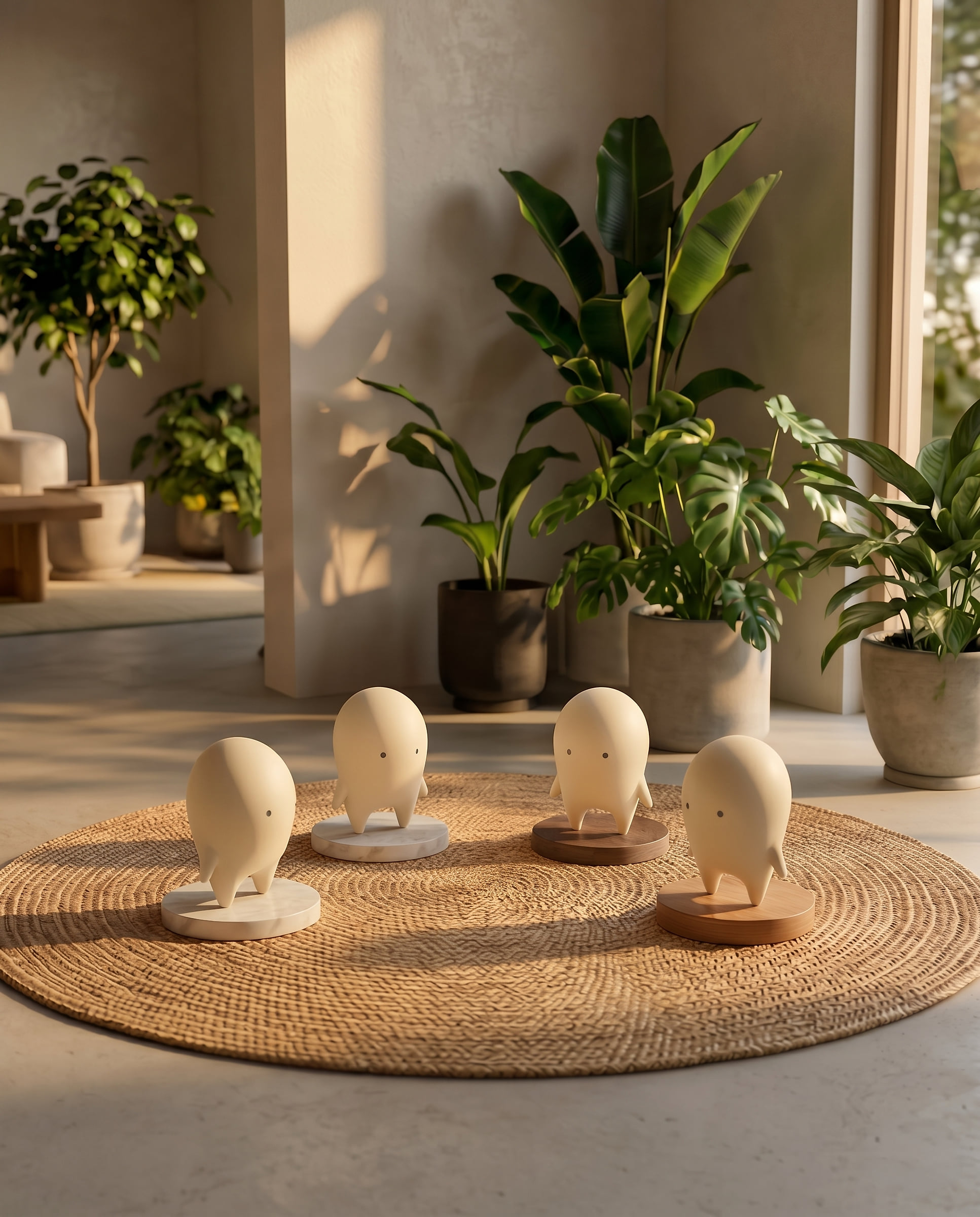
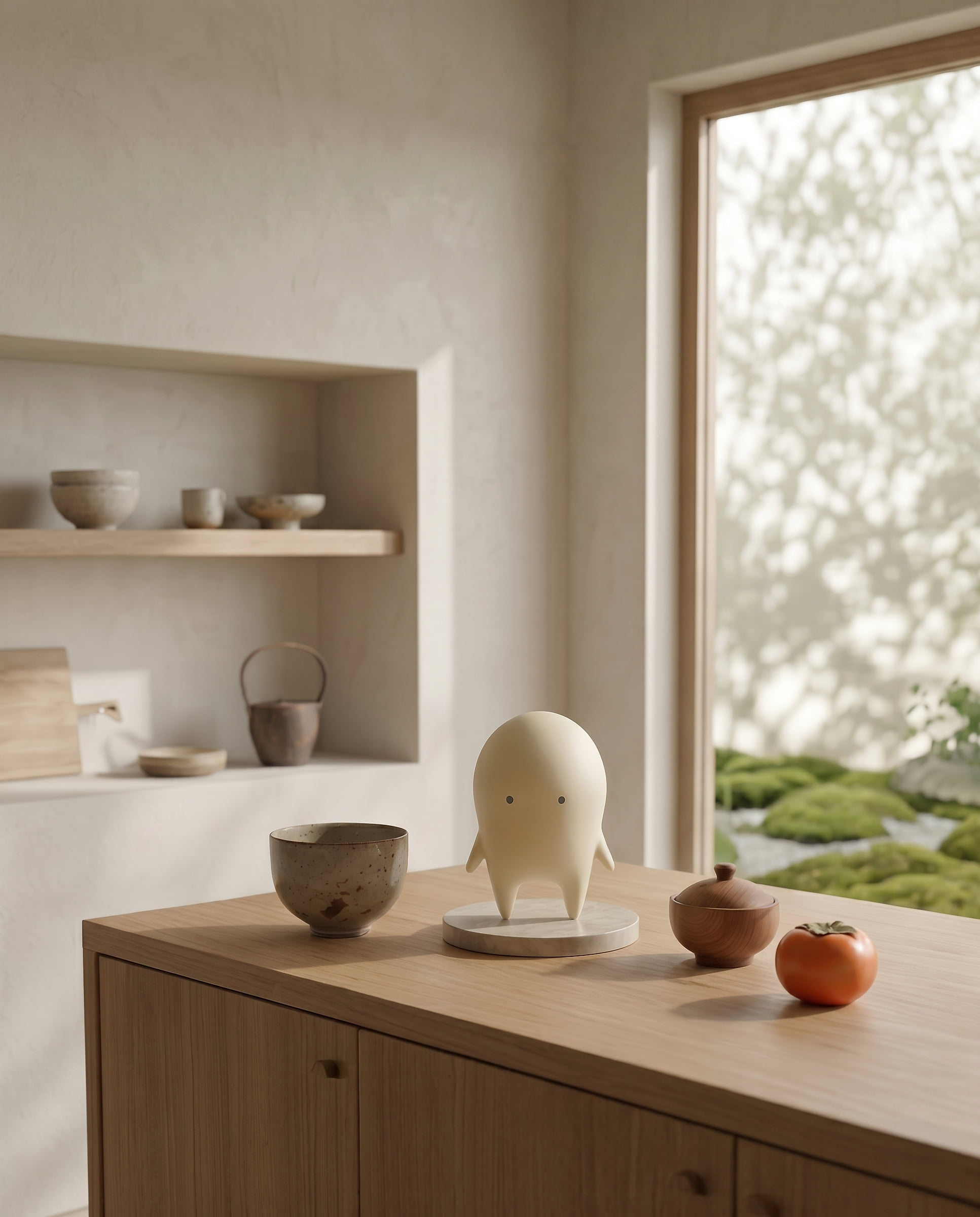
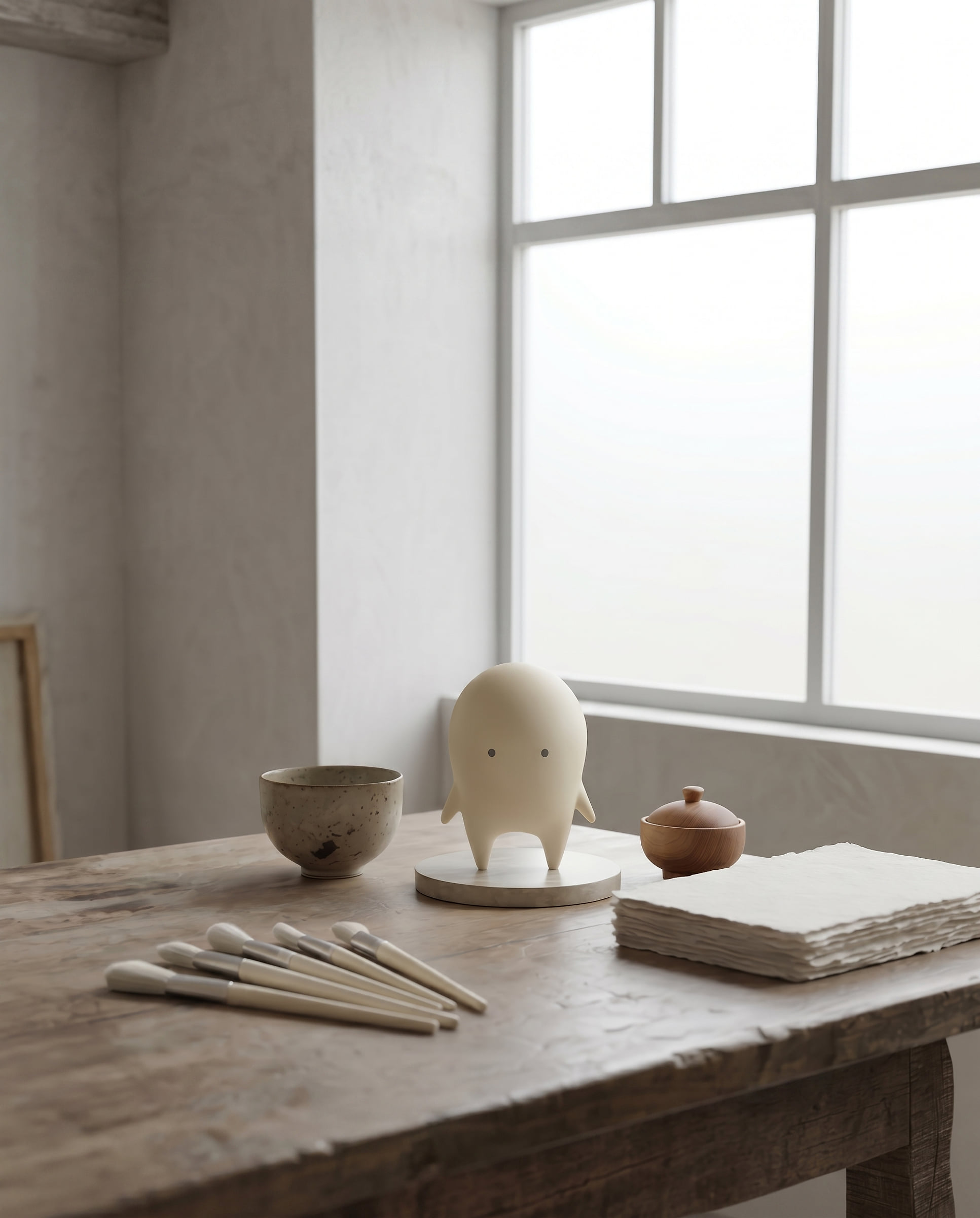
The figure carries the character off the page and into the hand: about ten centimetres tall, finished by hand by Rieko, and made in small numbered editions that are never reissued. It comes in two finishes, Natural and Sumi, and sits on a turned wooden base, so the object is part-made by hand rather than described that way.
Photograph it the way the brand photographs everything: natural light, real materials, and room around the object.
12 Auwa / In use
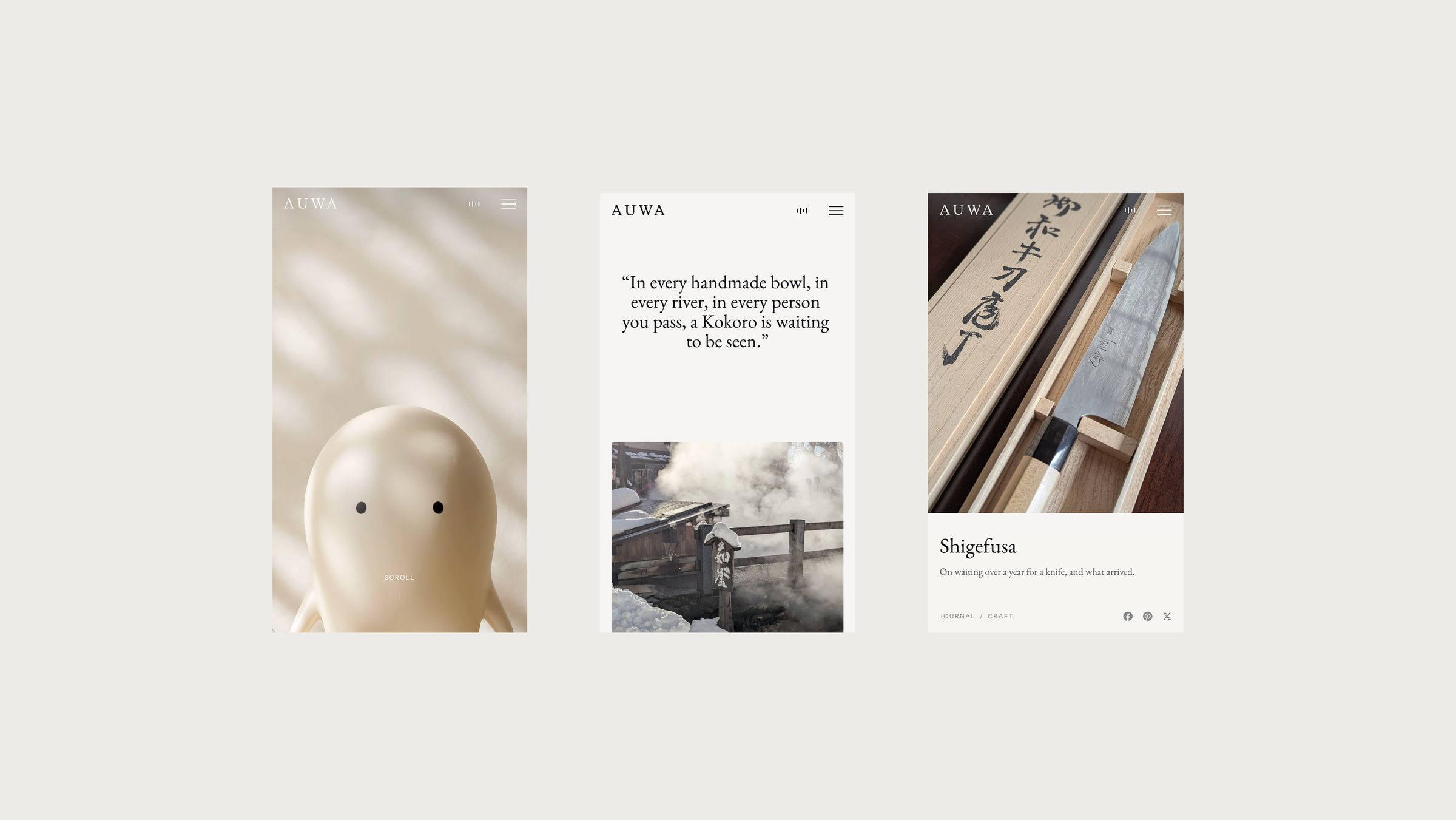
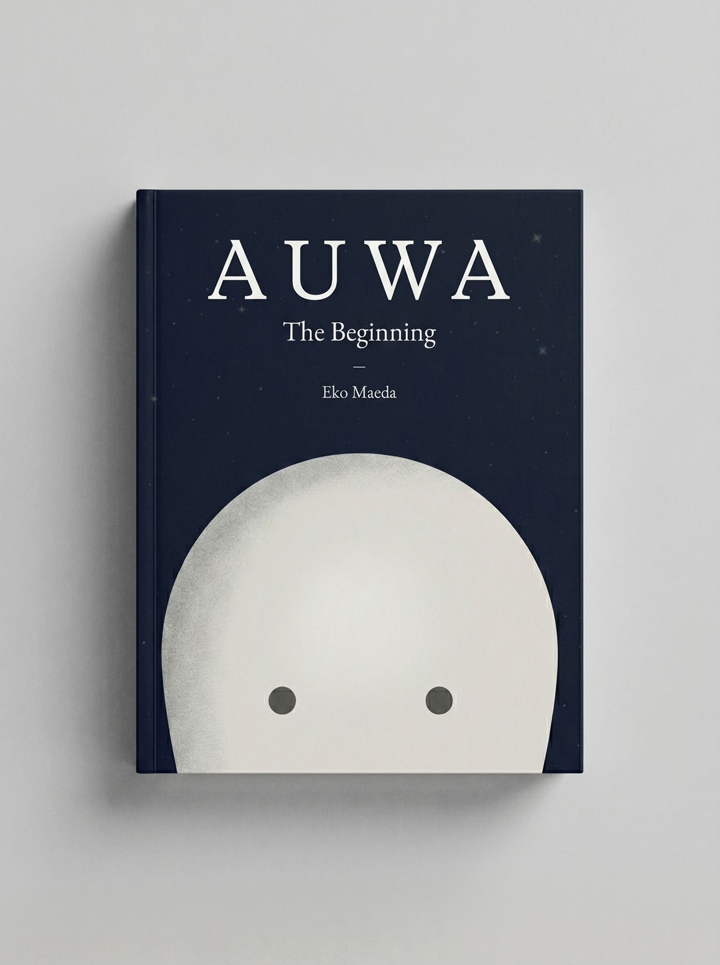
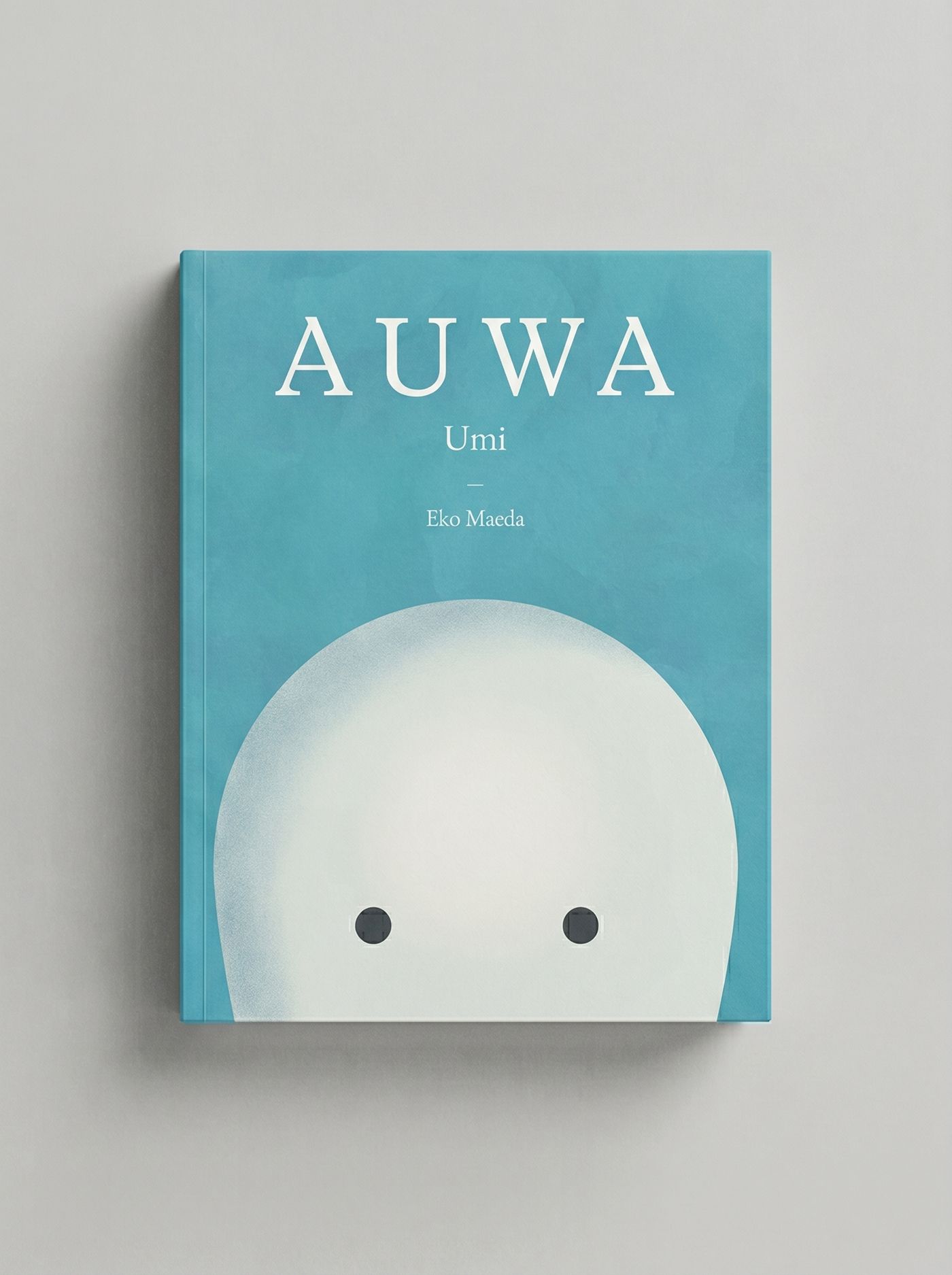
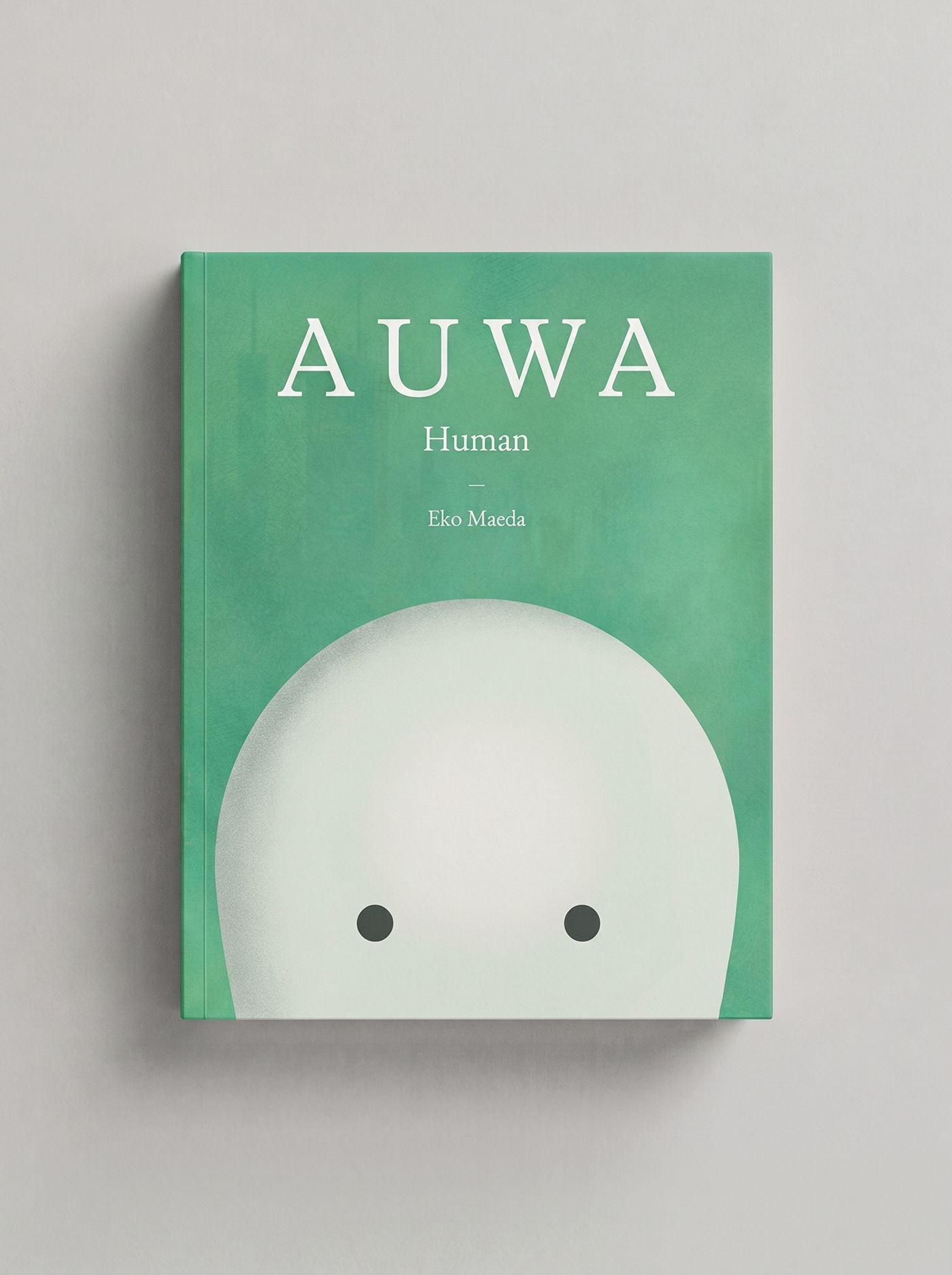
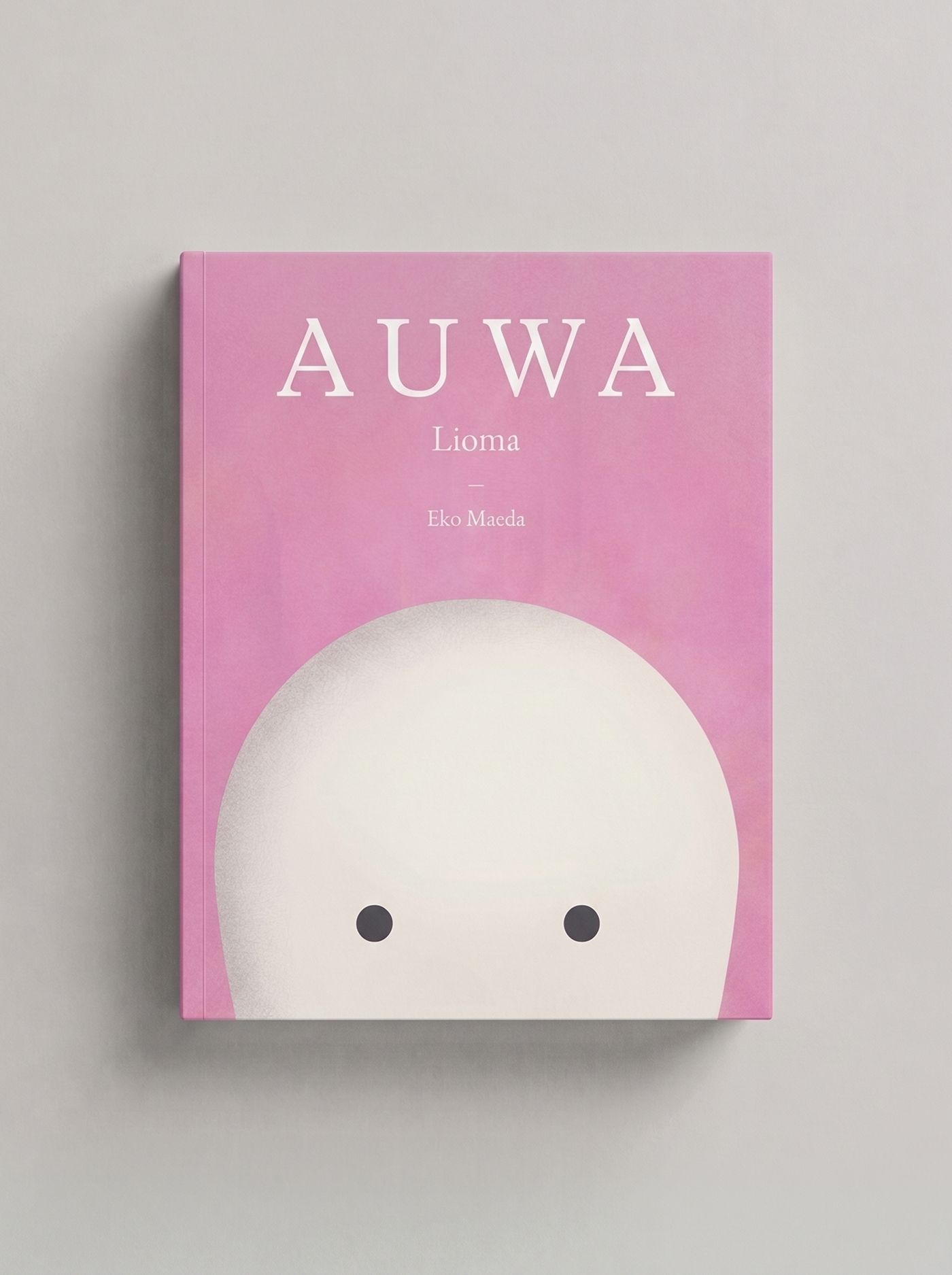
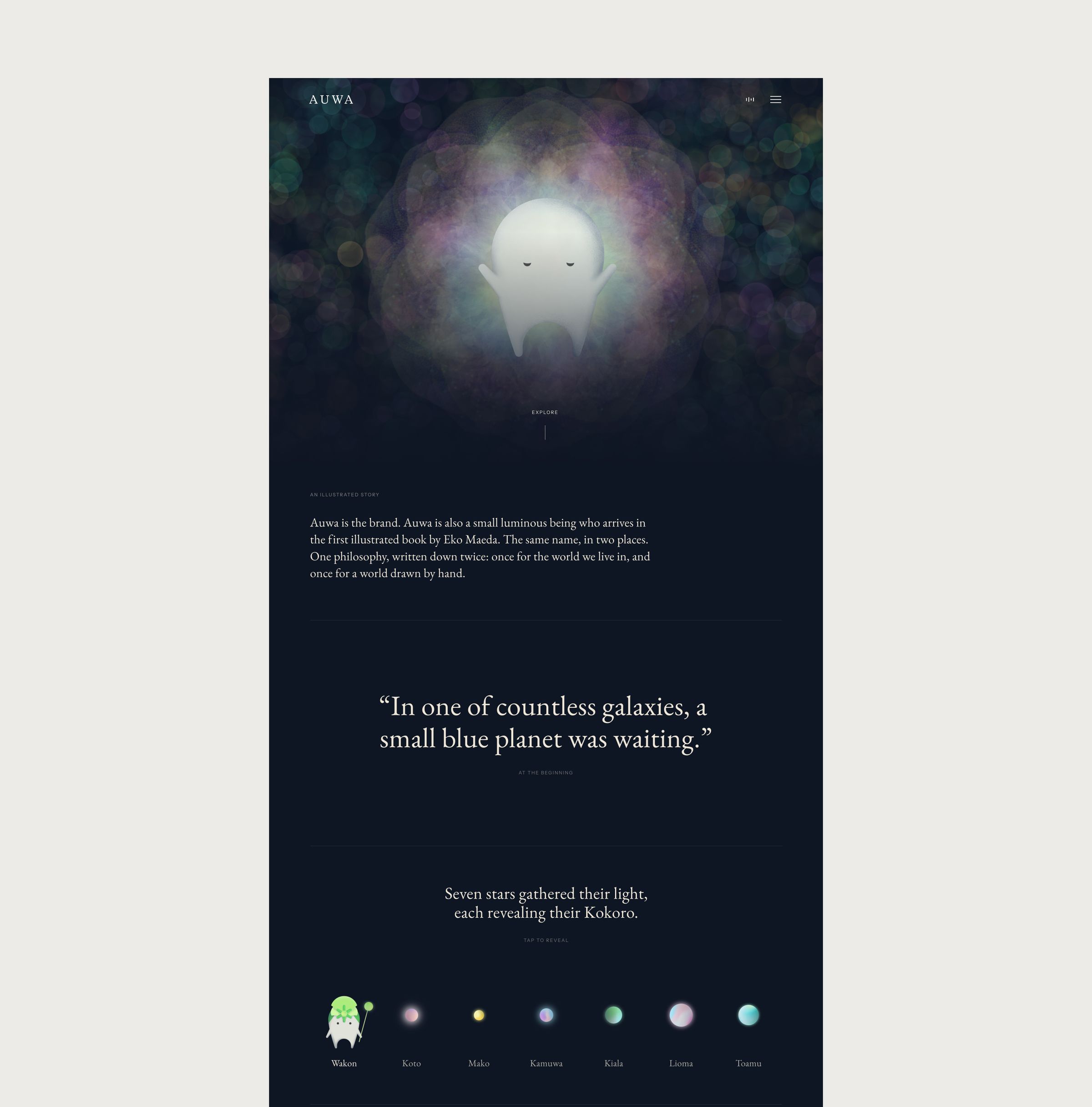
The world as it ships: the website, the journal and the four illustrated books, on one domain and one set of tokens.
13 Auwa / Files
Files
Everything below is yours. The Figma file is the source of truth for design, the asset pack is what production uses, and the markdown files carry the same decisions in a form your own AI tooling can read and your team can edit.
This page is built from brand.md. Edit the file and the page follows, which means the guidelines, the asset pack and whatever your team generates with AI all stay on the same source. There is no version of this document that can quietly go out of date while the file stays right.
- Wordmark, darkSumi. For light backgrounds.SVG · 4 KB ↓
- Wordmark, lightWashi. For dark backgrounds.SVG · 4 KB ↓
- Wordmark, dark2048px wide, transparent.PNG · 4 KB ↓
- Wordmark, light2048px wide, transparent.PNG · 4 KB ↓
- Wordmark, inheritingFill set to currentColor, for inline use in code.SVG · 4 KB ↓
- Font filesAll three families, desktop and web, with the OFL licence.ZIP · 4.6 MB ↓
- Colour and motion tokensCustom properties, ready to drop into a stylesheet.CSS · 1 KB ↓
- Colour and motion tokensThe same values as data, for build tooling.JSON · 3 KB ↓
- brand.mdThis document as a machine-readable file. Point your AI tooling at it.Markdown · 28 KB ↓
- DESIGN.mdThe same system in Google's open DESIGN.md format, which most AI coding tools already read.Markdown · 6 KB ↓



Straight into a codebase
@import url("https://moreair.co/brand/auwa/tokens.css");

.headline {
  color: var(--sumi);
  font-family: "EB Garamond", Georgia, "Times New Roman", serif;
}
10 Auwa / Social
Social
The grid should feel like opening a book of quiet pages, every thumbnail belonging in the same room. Feed posts are 4:5 (1080 by 1350), with generous padding, text aligned to the same invisible grid, and never more than one accent colour.
10 Social / Slideshow washes
Slideshow washes
A journal article becomes a four-slide carousel: a full-bleed photograph, the anchor quote on a coloured wash, a rest image, and a close on the same wash. Choose the wash that matches the photography's tone, not only the subject.
Stone for philosophy and evening, Kraft for craft and wood, Moss for forest and mountain, Ink for fire and night, and Washi for snow, mist and anything high-key. Text is white on every wash except Washi, which takes a near-black.